Beaver Builder Theme areas mapped to CSS
The following diagram of a boxed layout shows each of the Beaver Builder Theme's header, content, footer, and page areas mapped to Customizer setting and CSS class.
info
This diagram also applies to full-width layout, but the page background color (set at General > Background) will only appear in a thin band at the bottom of the browser page under certain viewing conditions.
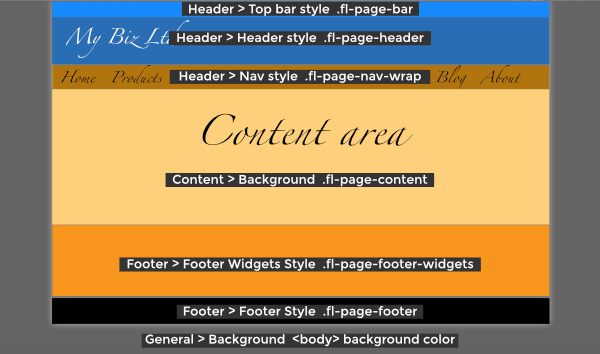
- The top bar background and text colors can be set at Customize > Header > Top bar style, which translates to the CSS class
.fl-page-bar. - The header background and text colors can be set at Customize > Header > Header style, which translates to the CSS class
.fl-page-header. - If you choose a Preset layout whose nav bar is a different color from the header, you can customize the nav bar at Customize > Header > Nav style, or you can write a CSS rule for the class
.fl-page-nav-wrap. - The background for the content area is set at Customize > Content > Content background and translates to the CSS class
.fl-page-content. - The footer widget background and text colors can be set at Customize > Footer > Footer widgets style, which translates to the CSS class
.fl-page-footer-widgets. - The footer background and text colors can be set at Customize > Footer > Footer style, which translates to
.fl-page-footer. - The page background color, which displayed outside the box, is set at Customize > General > Background. This background color is set on the
<body>tag.