The General tab in Customizer
The General tab contains the following subtabs.
Layout
The Layout tab has the following settings.
Width
Choose whether you want a full-width or boxed layout, as described below.
You need to set rows to full width in your Beaver Builder content layouts to take advantage of full-width layout in the theme.
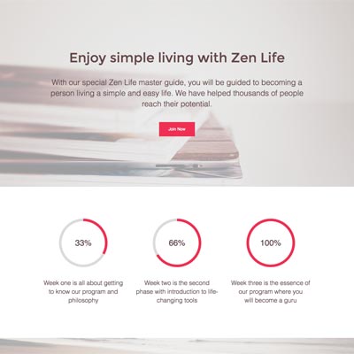
Full width
With a full-width layout, rows in your content layouts can span edge to edge in the browser window, as shown in this screenshot.
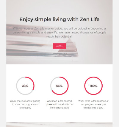
Boxed
With a boxed layout, your page appears to be "boxed" or have a border around it. You can add more space at the top of the box or add a shadow to it, as described in the following sections.
See the overview of full-width and boxed layouts.
Content width
Sets the maximum width of the header and footer text within the full-width or boxed layout.
The default maximum content width for header and footer content is 1100 pixels. Setting the Content width value higher can result in header and footer margin problems when resizing the browser window--make sure to test.
If you want row content in your content layout to have the same width as your header and footer content width, set the same width as a global setting for rows in the Beaver Builder editor. See the article on setting global row widths for instructions.
Spacing (boxed layouts only)
This field only appears when you choose a boxed layout width. You can customize the number of pixels of spacing on the top and bottom of the box.
Drop shadow size (boxed layouts only)
Set the number of pixels that will be used for a drop shadow along the box border. The larger the pixel amount, the larger the shadow.
Drop shadow color (boxed layouts only)
Choose a color for the drop shadow. In general, dark grays resemble shadows more realistically.
Scroll to top button
If this setting is enabled, then an upward arrow icon appears in the lower right corner of the page view once you have scrolled a certain distance down the page. Clicking the button executes a smooth scroll back to the top of the page.

CSS Framework
You can choose Bootstrap 3 or 4. If you're not sure, choose None. See the article about Bootstrap versions.
Font Awesome icons
You can control how Font Awesome 5 loads by making one of the following choices:
- Load the Font Awesome icons only if Beaver Builder detects it is needed.
- Load the Font Awesome icons on every page.
- Convert existing Font Awesome 4 icons.
See this article about how Font Awesome icons load for details.
Theme medium breakpoint and mobile breakpoint
A breakpoint is the number of pixels of browser width below which medium-device behavior or small-device behavior starts. Defaults are 992px for Medium and 768px, respectively.
These settings affect Theme behavior with respect to header and nav layouts.
For theme headers, the Nav Right, Nav Left, and Nav Centered + Inline Logo change to Nav Centered (menu below the logo) on medium and small devices.
For navigation layouts, the Nav menu collapses to a Hamburger icon or MENU link on small devices.
The Beaver Builder plugin also has default breakpoints to control responsive behavior in content areas and in Themer layouts, which differ by one pixel. For a description of the difference, see the article on Beaver Builder breakpoints.
Background
Sets a background color or image for the entire browser window. For more details, see the article about setting a background color or image for the browser window.
Accent Color
By default, the accent and hover colors that appear in this section are set by the theme's preset style, which is set at Customize > Presets. See the article about the Presets tab for more information.
You can override the preset default colors by setting your own. These custom defaults can then be overridden in individual rows, columns, and modules in the Beaver Builder editor.
The accent color is used to color elements such as links and buttons. Note that you can override the color of buttons in individual modules.
The hover color sets the color of linked text and buttons when the cursor hovers over it.
Headings
You can set heading styles that serve as the defaults in the Beaver Builder plugin (including Beaver Themer) and WordPress block editor layouts. Heading size can be configured responsively, in other words you can have different font sizes for large, medium, and small devices. See this article about responsive default heading styles and this article about system fonts.
Text
You can set custom font and other style defaults for non-heading text. See this article about responsive default text styles and this article about system fonts.
Buttons
You can set a default style for buttons in the Beaver Builder plugin editor, such as the Button module, the Callout module, and so on. See the article about setting global button styles for more details.
Social Links
Configure which social icons appear in your theme by entering links to your page for each social site you want to show. You can also set the icon color as either monochrome or branded with the colors of each social site.
Here are the Customizer locations where you can add social icons to your theme's layout:
- Header > Top bar layout
Choose social icons for either Column 1 or Column 2. Monochrome icons appear in the link color you defined in Header > Top bar style.
- Header > Header layout
Choose the Nav Bottom layout, and in the Content Layout setting choose social icons. They will appear to the right of the header logo area. Monochrome icons appear in a circle in the link color you defined in Header > Header style. Branded icons appear in a circle with their branded letter font and their brand color in a circle:
- Footer > Footer layout
Choose social icons for either Column 1 or Column 2. Monochrome icons appear in a circle in the link color you defined in Footer > Footer style. Branded icons appear in a circle with their branded letter font and their brand color in a circle.