Responsive Design
In this section, you will find articles that describe how to use Beaver Builder's responsive tools in order to create layouts that look great on all devices.
Check out our free responsive design course to learn more about the responsive editor and other features that ensure your layouts look great on all devices.
Responsive Behavior
Layouts created with Beaver Builder are fully responsive out of the box, which means they automatically adjust to fit different screen sizes, ensuring that your layouts will look great on any device. It is also possible to fine-tune your responsive layouts even further with Beaver Builder's responsive features.
You can see how your layouts adapt to different screen sizes in the screenshots below.
- Large
- Medium
- Small
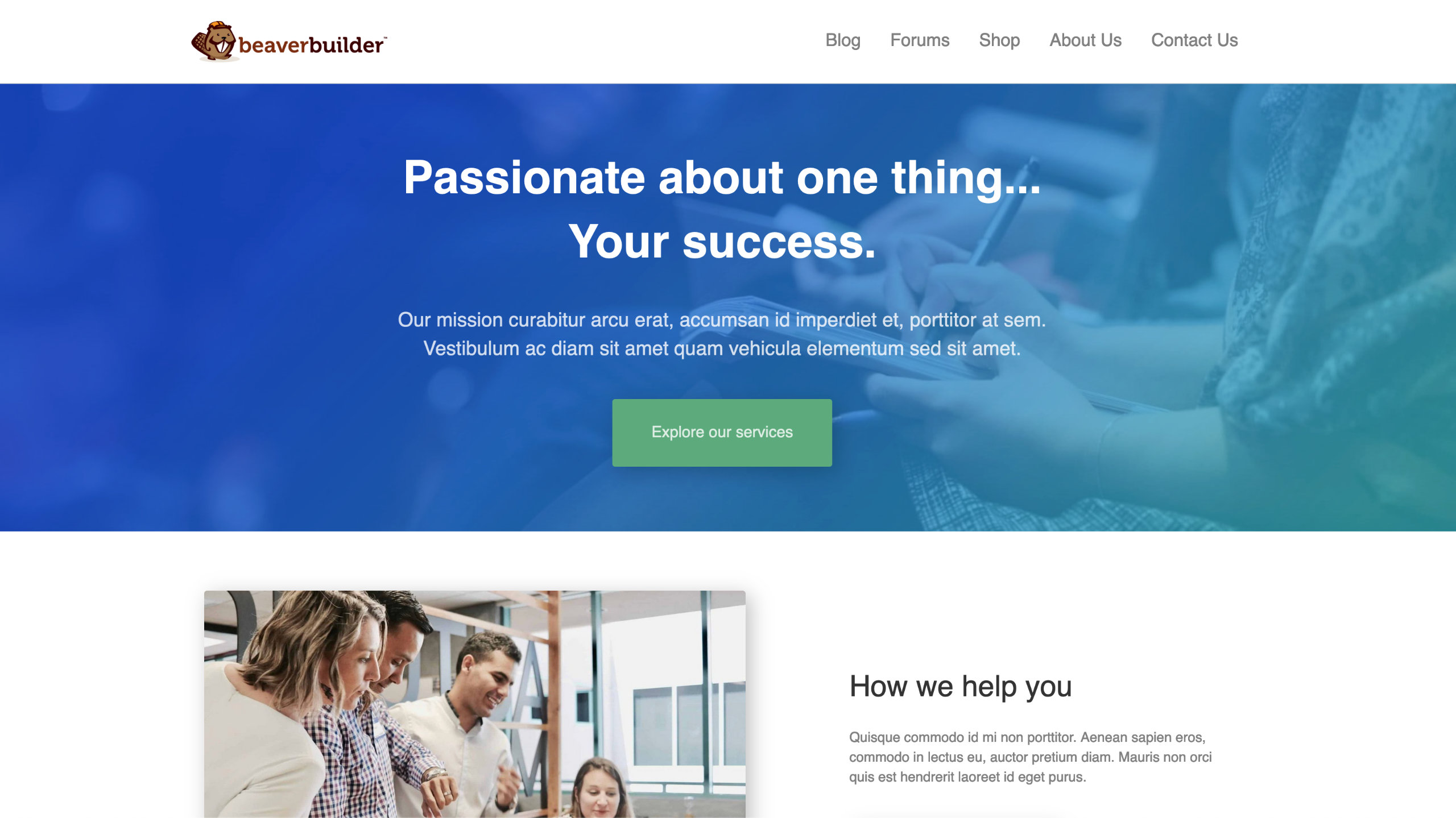
The screenshot below shows how your website appears on a large and extra large devices.
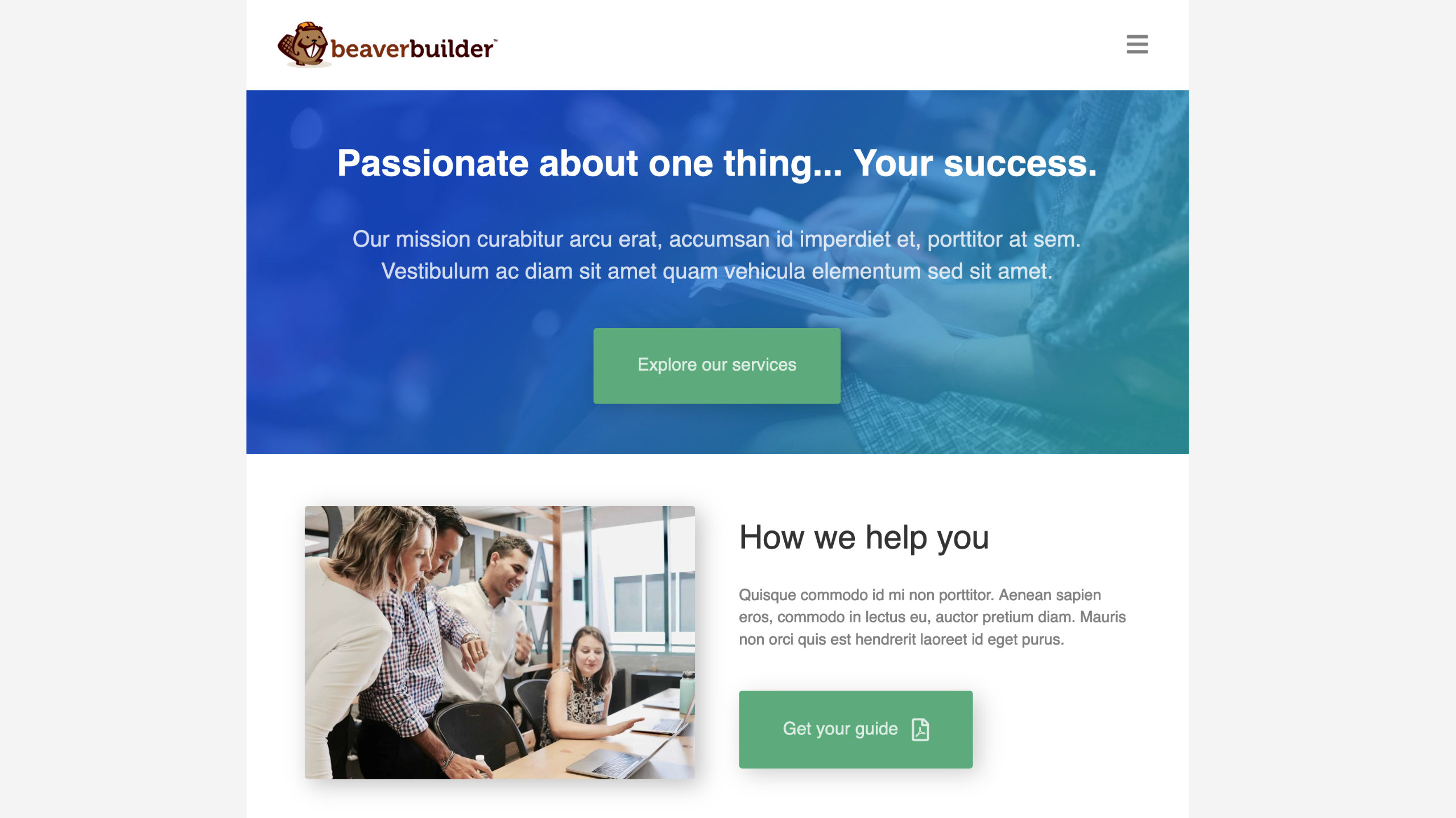
The screenshot below shows how your website appears on a medium devices.
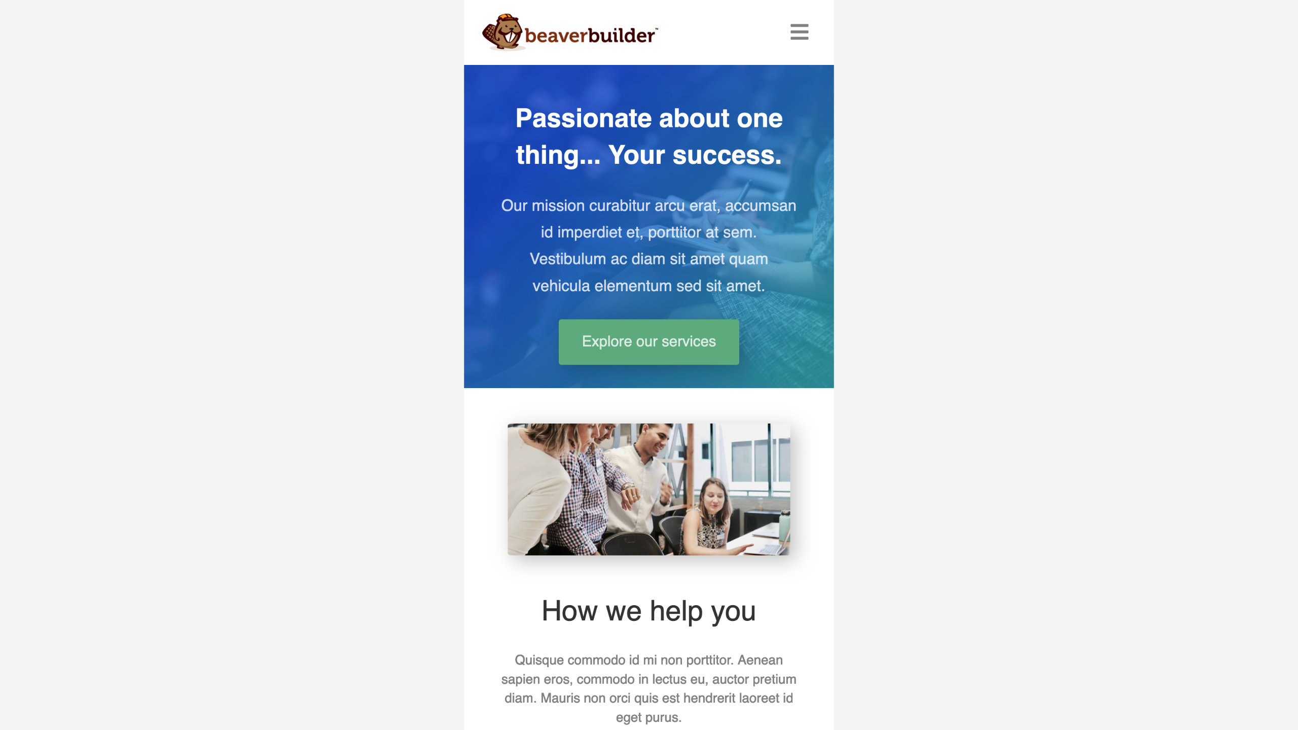
The screenshot below shows how your website appears on a small devices.
Responsive Features
Beaver Builder provides the following features to fine-tune your responsive layouts further.
You can preview and edit your layouts in a way that ensures they look great on all devices using the Responsive Editor mode. In addition, you can set custom width and height values to preview your website in a variety of widths and heights.
With Custom Breakpoints, you can set your own preferred widths for different device sizes overriding Beaver Builder's default breakpoint values.
Using Visibility options, you can hide specific nodes (rows, columns, and modules) on your website for selected devices, allowing you to customize your user experience accordingly.
By using the Responsive Toggle, you can define different row, column, and module settings per device, such as margins, padding, and even background images.
Columns stack automatically for small devices due to the limited viewing area, and one column is usually the best design. You can avoid and control column stacking by setting custom column widths for each device size, or by reversed column stacking order.
In this section
📄️ Responsive Editor
The Spacing section in the Advanced tab lets you change the default margin and padding for rows and columns. For modules, you can change the default margin values only.
📄️ Breakpoints
The Spacing section in the Advanced tab lets you change the default margin and padding for rows and columns. For modules, you can change the default margin values only.
📄️ Responsive Device Toggle
With the Responsive Device Toggle, you can configure row, column, and module options according to the size of the device.
📄️ Disable Responsive Behavior
The Spacing section in the Advanced tab lets you change the default margin and padding for rows and columns. For modules, you can change the default margin values only.
📄️ Responsive columns
Columns in layouts can become quite complex, with multiple column groups in rows, child columns, and multiple modules in a single column group. For an overview of columns with many visual examples, see the column layouts overview.