Modules
Beaver Builder is equipped with an extensive collection of modules that provide users with a wide range of options to create and design websites that cater to their needs and preferences.
What are Modules?
In Beaver Builder, modules are building blocks that contain content and can be added to any column. These modules are similar to WordPress widgets, but provide more advanced customization and styling choices. Each module serves a specific purpose, such as text, images, videos, buttons, and more. You can configure and arrange each module to create unique designs and layouts without requiring any coding experience.
You can override modules to add custom functionality, as well as create custom modules using our API. For more information, refer to the Custom Module API developer article.
Module Types
There are three types of modules available:
Content Modules: These are standard modules that add content to the layout, such as Heading or Photo modules.
Container Modules: These modules act as containers, do not require rows or columns for structure, and offer specific layout controls. Examples include Box and Loop modules.
Block Modules: These modules are available in the WordPress Block editor.
Inherit Styling
In order to ensure consistent color and typography, Beaver Builder modules follow a cascading inheritance model whereby they inherit the styling provided by the current theme. This means that when users add headings or text to layouts using modules such as the Heading or Text modules, they will automatically adopt the heading and text styling of the theme.
You can override this behavior by using the module styling options. For instance, if a user adds a Heading module to their layout, they can adjust the heading font size or change the heading text color using the Heading module styling options.
The following diagram provides a visual representation of how the process works.
Access Modules
- Launch Beaver Builder on your page or post.
- On the Top bar, click the Plus symbol (+) to open the Content Panel.
- Click the Modules tab to access all Standard Modules.
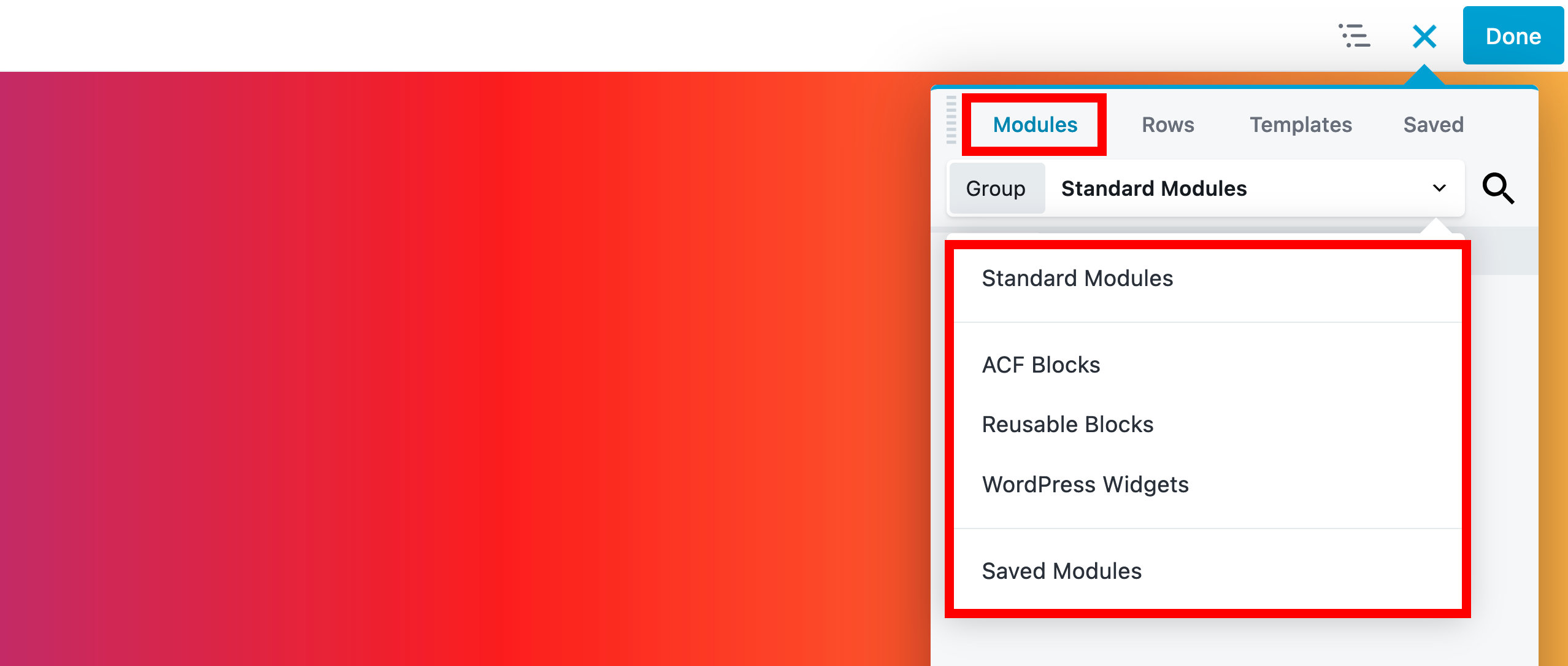
Module Subgroups
Beaver Builder groups modules into different subgroups for better organization. These subgroups can be accessed via the Modules group dropdown menu. There may also be subgroups of third-party modules, depending on other plugins you have installed.
The following are the different module subgroups available.
Standard Modules All modules included with Beaver Builder are listed in the Standard Modules group. If you disable modules via the Beaver Builder settings, they do not appear in the Standard Modules group.
ACF Blocks If you have the Advanced Custom Fields plugin installed, any ACF blocks you create will appear in the ACF Blocks group.
WordPress Patterns (Reusable Blocks) Any WordPress Patterns (Reusable Blocks) created will appear in the WordPress Patterns group.
Themer Modules The Themer Modules subgroup displays a list of all Beaver Themer modules that are available when using the builder on a Beaver Themer layout.
WordPress Widgets Most WordPress widgets, including third-party ones, can be integrated into your Beaver Builder layout. Third-party widgets, however, may require custom code to work properly.
See the WordPress Widgets article for more information.
Saved Modules Any modules saved for reuse will appear in the Saved Modules group, this includes global modules as well.
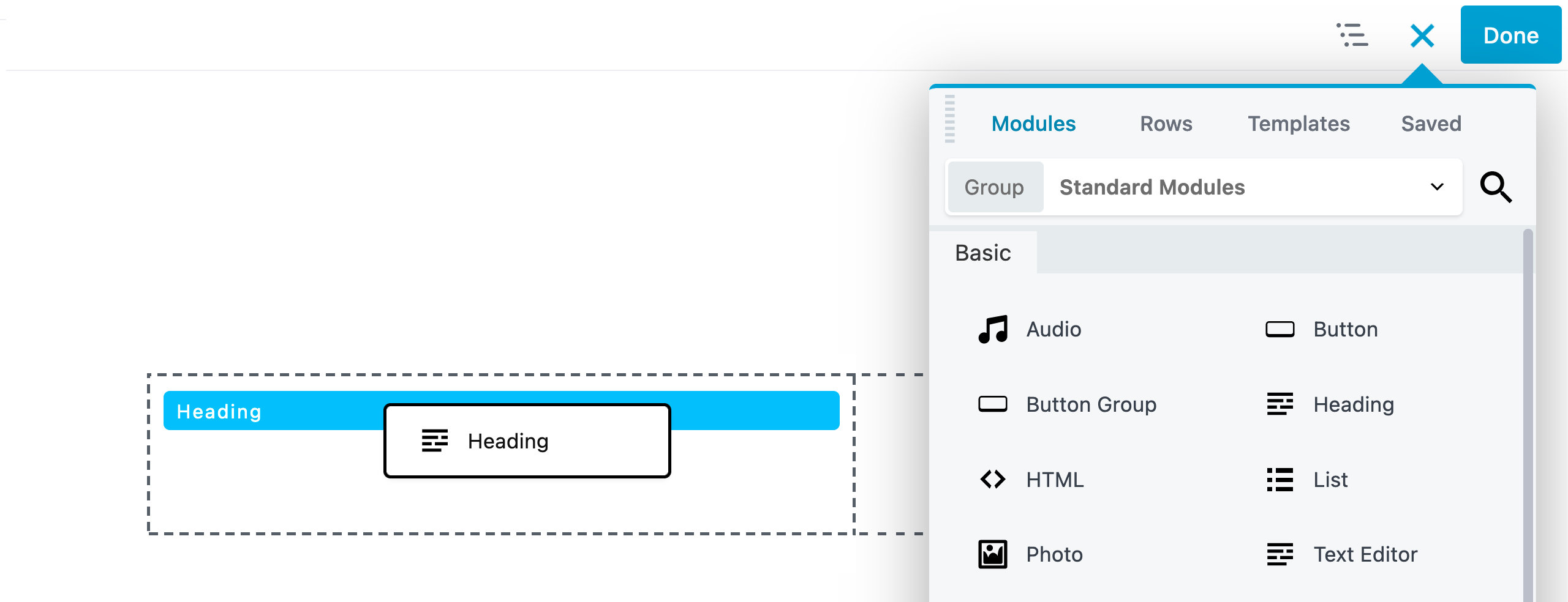
Add Modules
- Click the Plus symbol (+) to open the Content Panel.
- Click the Modules tab to access all modules.
- Drag and drop the module you want to use into our layout.
Module Settings
- Move your mouse cursor over the module you want to configure.
- In the Module overlay actions click the Wrench icon.
- Configure the module according to your preferences in the module settings window.
- Click Save when you're happy with your changes.
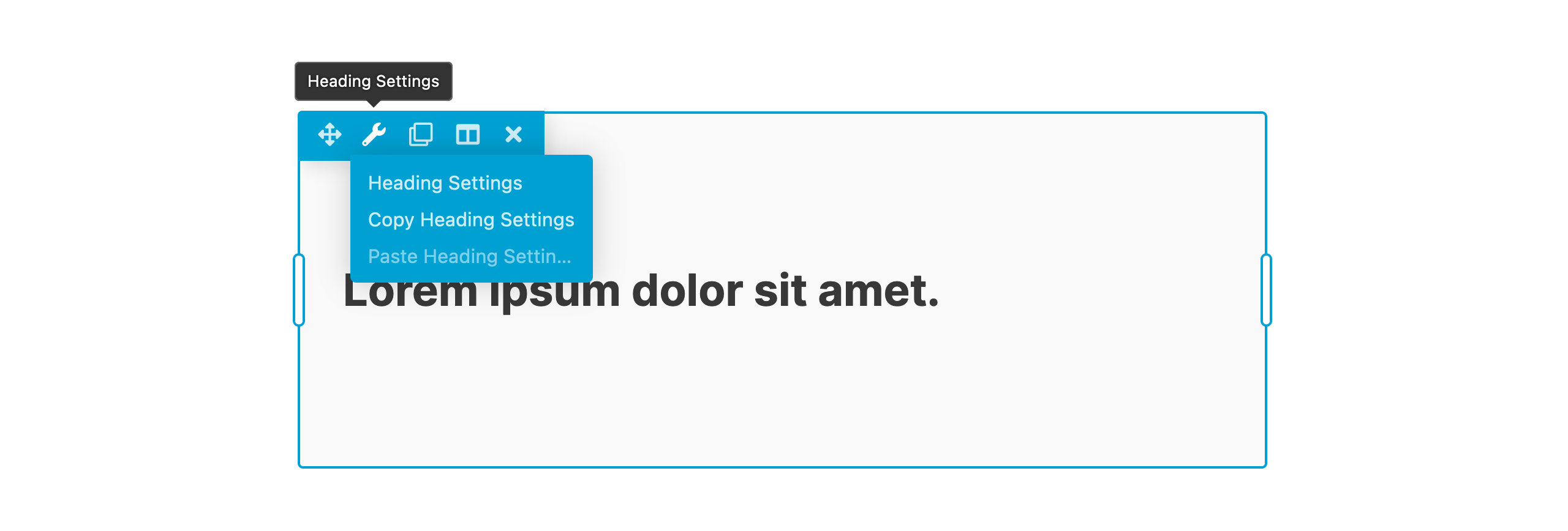
You can also access the module settings by right-clicking on the module in the Outline Panel.
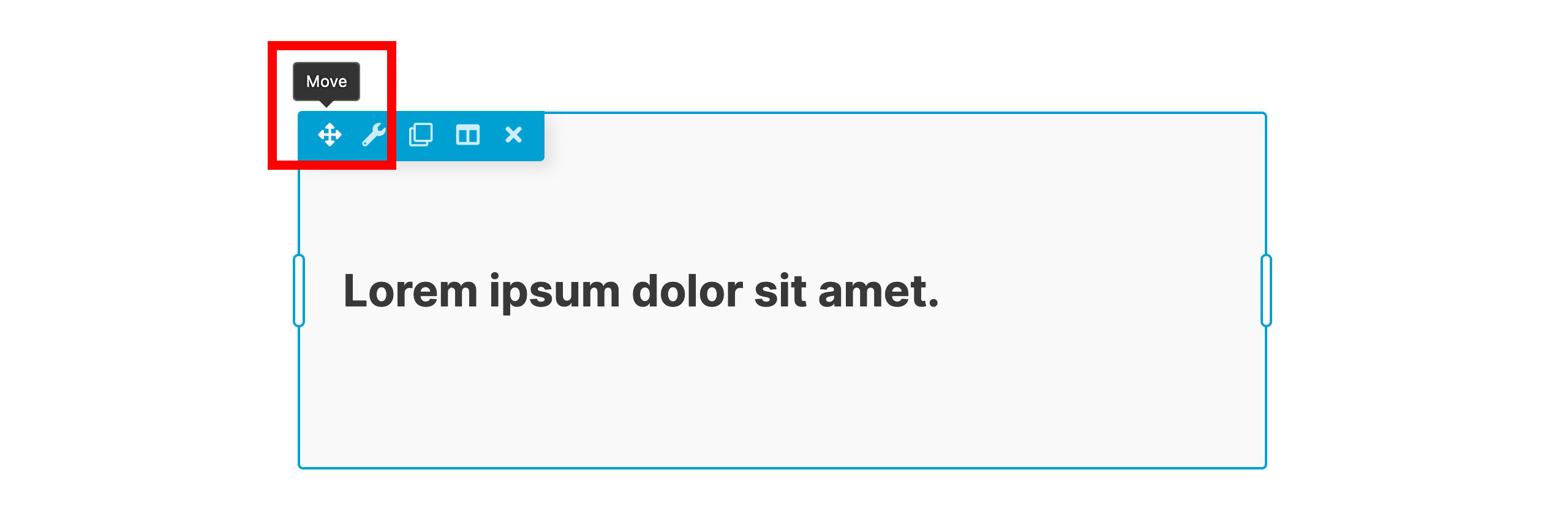
Move modules
Modules can be moved from one column to another or be used to create a new column.
- Move your mouse cursor over the module you want to move.
- In the Module overlay actions click and hold the Move icon.
- Drag the module to move to another position in your layout.
Delete modules
- Move your mouse cursor over the module you want to delete.
- In the Module overlay actions click the Close icon to delete the module.
- Verify that you want to remove the module.
In this section:
📄️ Accordion
Use Accordion to present expandable content sections in a compact layout with manual items or post-based content.
📄️ ACF Blocks
Display Advanced Custom Fields (ACF) blocks inside your Beaver Builder layouts.
📄️ Audio
Use Audio to add a single audio player or playlist from the WordPress Media Library or a direct audio file URL.
📄️ BigCommerce
Use BigCommerce Products to display a filtered BigCommerce product gallery with optional pagination.
📄️ Box
A flexible container to arrange content using Flexbox, CSS Grid, or layered positioning with full control over spacing, backgrounds, and sizing.
📄️ Button
Use Button to add a styled call to action that links to content, runs custom click behavior, or opens lightbox content.
📄️ Button Group
Display multiple buttons together in a single module with shared global styles and per-button overrides for text, icons, click actions, and appearance.
📄️ Callout
Combine a heading, descriptive text, an optional image or icon, and a call-to-action link or button into a single attention-grabbing block.
📄️ Contact Form
Use Contact Form to add a simple email form with configurable fields, spam protection, and post-submit actions.
📄️ Content Slider
Use Content Slider to display multiple slides with background images, video, or color, combined with optional headings, text, and call-to-action buttons.
📄️ Countdown
Use the Countdown module to display a live timer that counts down to a target date and time.
📄️ Call to Action
Use Call to Action to display a heading, body text, and a styled button together as a single structured prompt for site visitors.
📄️ Gallery
Use Gallery to display multiple photos in a collage or grid layout with optional captions, lightbox, and SmugMug support.
📄️ Heading
Add styled heading text to your layout using semantic HTML heading tags, with full control over typography, alignment, and responsive behavior.
📄️ HTML
Versatile module for inserting HTML, CSS, JavaScript code, and shortcodes directly into your page layouts
📄️ Icon
Use Icon to display a single icon with optional title text, custom colors, sizing, and an optional link.
📄️ Icon Group
Use Icon Group to display a row of linked icons with shared sizing, spacing, alignment, and per-icon color overrides.
📄️ Modules
Beaver Builder is equipped with an extensive collection of modules that provide users with a wide range of options to create and design websites that cater to their needs and preferences.
📄️ List
Use List to output a structured list of items with optional icons, headings, and rich content using ordered, unordered, or generic list markup.
📄️ Login Form
Use Login Form to add a front-end login and logout form with configurable fields, icons, and post-submit redirects.
📄️ Loop
Use the Loop module to build fully custom post loops with complete design control over each item, using any Beaver Builder module as the template. Requires Beaver Themer.
📄️ Map
Use Map to embed a Google map for any street address inside your layout.
📄️ Menu
Use Menu to render a WordPress navigation menu with horizontal, vertical, accordion, or expanded layouts and a configurable responsive toggle.
📄️ North Commerce
Use North Commerce to display products, galleries, sliders, cart, and checkout from your North Commerce store.
📄️ Number Counter
Use Number Counter to display an animated number, percentage, circle, or bar that counts up when it scrolls into view.
📄️ Photo
Use Photo to upload an image or display one from the Media Library with cropping, alignment, captions, and link options.
📄️ Popup
Use Popup to build dialogs, popovers, and flyouts that overlay page content with configurable triggers, scheduling, and dismiss behavior.
📄️ Posts Carousel
Use Posts Carousel to display a sliding carousel of WordPress posts with configurable layout, content, and slider controls.
📄️ Posts
Use Posts to display a queried list of WordPress posts in columns, masonry, gallery, or list layouts with full control over content, style, and pagination.
📄️ Posts Slider
Use Posts Slider to display a slider of WordPress posts with featured image, post info, and excerpt content.
📄️ Pricing Table
Use Pricing Table to build side-by-side pricing boxes with feature lists, ribbons, dual billing, and call-to-action buttons.
📄️ Rich Text Editor
Add and format rich text in your layouts using the WordPress Classic Editor.
📄️ Search
Use Search to add a WordPress search form with configurable layout, optional inline AJAX results, and post type filtering.
📄️ Separator
Use Separator to add a configurable horizontal divider line that breaks up content within a layout.
📄️ Sidebar
Use Sidebar to display a WordPress sidebar registered by the current theme inside a Beaver Builder layout.
📄️ Slideshow
Use Slideshow to display multiple photos in a full-featured slideshow with transitions, navigation controls, and optional thumbnails.
📄️ Social Buttons
Use the Social Buttons module to add social sharing buttons for Facebook, Twitter, and Google+ to encourage visitors to share your content.
📄️ Star Rating
Use Star Rating to display a configurable star rating with custom totals, fill levels, icons, colors, and sizing.
📄️ Subscribe Form
Use Subscribe Form to add a name and email opt-in form that sends new subscribers to a connected email marketing service.
📄️ Tabs
Use Tabs to display a collection of tabbed content built from manual items or post-based content.
📄️ Testimonials
Use Testimonials to display an animated slider of customer quotes with configurable autoplay, transitions, and styling.
📄️ Video
Use Video to render a self-hosted media library video or an embedded video from providers like YouTube and Vimeo.
📄️ Widgets
Use WordPress widgets inside Beaver Builder layouts for plugin-specific features not covered by native modules.
📄️ WooCommerce
Use WooCommerce to display products, categories, and core WooCommerce pages from your store inside a Beaver Builder layout.
📄️ WordPress Patterns
Drag saved WordPress Patterns directly into Beaver Builder layouts and keep them in sync with the source content.