Menu
Use Menu to render a WordPress navigation menu with horizontal, vertical, accordion, or expanded layouts and a configurable responsive toggle.
Usage
Use Menu to render a WordPress menu created under Appearance > Menus as a fully styled navigation. The module supports horizontal, vertical, accordion, and expanded layouts, optional submenu indicators, an inline logo for centered horizontal menus, an optional search field, and an optional WooCommerce cart item. It also handles responsive behavior with a hamburger, labeled hamburger, text button, or always-expanded toggle, and supports inline, below-row, overlay, and flyout reveal styles.
Use Menu in headers, footers, sidebars, and saved templates that need a configurable site navigation without a separate menu plugin. It fits theme builder header layouts, mobile-first navigation patterns, and pages that combine navigation with search or cart entry points.
Module Settings
The Menu module settings control which WordPress menu is rendered, its layout and submenu behavior, optional centered logo, search and WooCommerce additions, the responsive toggle, and the appearance of links, dropdowns, and the responsive UI.
General Tab
The General tab selects the source menu, the desktop layout, submenu icons, and the responsive toggle behavior, and configures the optional inline logo and search additions.
Menu
Selects a WordPress menu created in the admin under Appearance > Menus. When no menus exist, the field shows a link to add one.
Layout Default: Horizontal
Sets the desktop layout used to render the menu.
- Horizontal: Lays the menu out in a single row with hover-revealed dropdowns.
- Vertical: Stacks menu items in a column with hover-revealed dropdowns.
- Accordion: Stacks menu items in a column with click-revealed dropdowns suitable for sidebars and mobile patterns.
- Expanded: Renders all submenu items inline beneath their parent without a hover or click toggle.
Horizontal Settings
Submenu Icon Default: None
Selects the indicator displayed next to items that have a submenu when Layout is set to Horizontal or Vertical.
- Arrows: Shows a directional arrow next to items with a submenu.
- Plus sign: Shows a plus sign next to items with a submenu.
- None: Hides the submenu indicator.
Accordion Settings
Submenu Icon click Default: Arrows
Selects the indicator displayed next to items that have a submenu when Layout is set to Accordion.
- Arrows: Shows a directional arrow that rotates when the submenu is expanded.
- Plus sign: Shows a plus sign that toggles when the submenu is expanded.
Collapse Inactive Default: Yes
Controls whether multiple accordion items can stay open at the same time. Yes keeps only one item open at a time. No allows multiple items to be open at the same time.
Menu Name Default: Menu
Used as the menu aria attribute for accessibility and as the label shown by the responsive menu toggle.
Centered + Inline Logo
The Centered + Inline Logo section adds a logo image positioned inline with the top-level menu items. This section is available when Layout is set to Horizontal.
Centered + Inline Logo
Logo Image
The image rendered inline within the top-level menu items.
Inline Logo Position Default: Left
Places the inline logo on the left or right side of odd menu items.
Search
The Search section adds a search trigger to the menu. This section is available when Layout is set to Horizontal or Vertical.
Search
Menu Default: Hide
Shows or hides the search item appended to the menu.
Label
Label Default: Show
Shows or hides the text label rendered next to the search icon when Menu is set to Show.
Icon
Icon Default: fas fa-search; Supports: Field Connections
The icon displayed for the search trigger when Menu is set to Show.
Responsive
The Responsive section configures the toggle used to reveal the menu on smaller screens.
Responsive
Responsive Toggle Default: Hamburger Icon
Selects the control rendered when the responsive breakpoint is met.
- Hamburger Icon: Renders an icon-only toggle button.
- Hamburger Icon + Label: Renders the hamburger icon next to the Menu Name label.
- Menu Button: Renders a text-only toggle button using the Menu Name label.
- None: Skips the toggle and keeps the menu visible at all sizes.
Responsive Style
Responsive Style Default: Inline
Selects how the revealed responsive menu is positioned. This field appears when Responsive Toggle is not set to None.
- Inline: Renders the revealed menu inline with the toggle.
- Below Row: Renders the revealed menu below the parent row.
- Overlay: Renders the revealed menu as a full-width overlay.
- Flyout Overlay: Slides the menu in over the page from the side.
- Flyout Push: Slides the menu in from the side and pushes the page content.
- Flyout Push with Opacity: Slides the menu in from the side, pushes the page content, and fades the page.
Flyout Position
Flyout Position Default: Left
Sets the side that flyout menus enter from. This field appears when Responsive Style is set to a flyout option.
Flyout Width
Flyout Width Default: 250
The width of the flyout panel in pixels. This field appears when Responsive Style is set to a flyout option.
Responsive Breakpoint
Responsive Breakpoint Default: Small Devices Only
The viewport size at which the responsive toggle takes over from the desktop layout. This field appears when Responsive Toggle is not set to None.
- Always: Uses the responsive toggle at every screen size.
- Large, Medium & Small Devices Only: Switches to the toggle below the large breakpoint.
- Medium & Small Devices Only: Switches to the toggle below the medium breakpoint.
- Small Devices Only: Switches to the toggle below the responsive breakpoint.
Stacked Layout
Stacked Layout Default: Yes
Stacks menu items vertically when Responsive Toggle is set to None.
Sub-menu Item Icon Default: None
Selects the icon used next to submenu items in the responsive menu.
- None: Hides the submenu item icon.
- Arrow: Shows an arrow next to submenu items.
WooCommerce Tab
The WooCommerce tab adds a cart entry to the menu and configures how the cart count and total are displayed.
Menu Cart Default: Hide
Shows or hides a WooCommerce cart item appended to the menu. The cart item only renders when WooCommerce is active.
Cart Icon
Cart Icon Supports: Field Connections
The icon displayed next to the cart content when Menu Cart is set to Show.
Show on Checkout
Show on Checkout Default: No
Controls whether the cart item remains visible on the WooCommerce cart and checkout pages when Menu Cart is set to Show.
Display Type
Display Type Default: Items Count
Selects what is rendered inside the cart link when Menu Cart is set to Show.
- Items Count: Shows the number of items currently in the cart.
- Total Amount: Shows the cart subtotal.
- Items Count and Total Amount: Shows both the item count and the cart subtotal.
Style Tab
The Style tab controls the appearance of the menu container, links, separators, dropdowns, the responsive dropdowns, the responsive toggle, the search field, and the WooCommerce menu cart.
Menu
The Menu section controls alignment and background color of the menu container.
Menu
Menu Alignment Supports: Responsive
The horizontal alignment of menu items within the menu container.
Menu Background Color Supports: Field Connections
The background color of the desktop menu container.
Menu Background Color (Mobile) Supports: Field Connections
The background color used for the menu container at the responsive breakpoint.
Links
The Links section controls the appearance of top-level menu links.
Links
Link Color Supports: Field Connections
The text color of top-level menu links.
Link Hover Color Supports: Field Connections
The text color used when a top-level link is hovered or matches the current page.
Link Hover Background Color Supports: Field Connections
The background color used when a top-level link is hovered or matches the current page.
Link Padding Default: 14; Supports: Responsive, Link Values
The inner spacing applied to each top-level link.
Link Typography Supports: Responsive
The font settings for top-level menu links.
Typography settings
Typography settings control font family, size, weight, line height, letter spacing, text transform, and responsive text styling where available.
Separators
The Separators section adds dividing lines between menu items.
Separators
Show Separators Default: No
Shows or hides separator lines between menu items.
Separator Color
Separator Color Default: #000000; Supports: Field Connections
The color of the separator lines drawn between menu items when Show Separators is set to Yes.
Dropdowns
The Dropdowns section controls the appearance of submenu panels and submenu links on desktop.
Dropdowns
Link Color Supports: Field Connections
The text color of submenu links.
Link Hover Color Supports: Field Connections
The text color used when a submenu link is hovered or matches the current page.
Link Hover Background Color Supports: Field Connections
The background color used when a submenu link is hovered or matches the current page.
Dropdown Background Color Default: #ffffff; Supports: Field Connections
The background color of the submenu panel.
Dropdown Shadow Default: Yes
Shows or hides a drop shadow on submenu panels.
Dropdown Padding Default: 0; Supports: Link Values
The inner spacing of the submenu panel.
Dropdown Link Padding Supports: Link Values
The inner spacing applied to each submenu link.
Dropdown Border Supports: Responsive
The border style, width, radius, and color of the submenu panel.
Dropdown Border Hover Color Supports: Field Connections
The border color used when the submenu panel or its links are hovered.
Dropdown Typography Supports: Responsive
The font settings for submenu links.
Typography settings
Typography settings control font family, size, weight, line height, letter spacing, text transform, and responsive text styling where available.
Responsive Dropdowns
The Responsive Dropdowns section overrides submenu colors when the responsive toggle is active.
Responsive Dropdowns
Link Color Supports: Field Connections
The text color of submenu links inside the responsive menu.
Link Hover Color Supports: Field Connections
The text color used when a submenu link inside the responsive menu is hovered or matches the current page.
Link Hover Background Color Supports: Field Connections
The background color used when a submenu link inside the responsive menu is hovered or matches the current page.
Dropdown Background Color Supports: Field Connections
The background color of submenu panels inside the responsive menu.
Responsive Toggle
The Responsive Toggle section controls the appearance of the hamburger or text toggle button. This section is available when Responsive Toggle in the General tab is not set to None.
Responsive Toggle
Size Default: 16
The font size of the toggle button, which scales the hamburger icon and label text.
Background Color Supports: Field Connections
The background color of the toggle button.
Hover Background Color Supports: Field Connections
The background color used when the toggle button is hovered or focused.
Color Supports: Field Connections
The icon and text color of the toggle button.
Hover Color Supports: Field Connections
The icon and text color used when the toggle button is hovered or focused.
Padding Default: 14; Supports: Link Values
The inner spacing of the toggle button.
Border settings
Border settings control border style, width, color, radius, and related responsive border controls where available.
Search Menu
The Search Menu section controls the appearance of the search trigger and reveal form. This section is available when Menu in the Search section is set to Show.
Search Menu
Icon Size Default: 16; Supports: Responsive
The font size of the search icon.
Icon Color Default: #808080; Supports: Field Connections
The color of the search icon.
Icon Hover Color Supports: Field Connections
The color of the search icon when hovered or focused.
Form Width Default: 400
The width of the revealed search form input.
Form Padding Default: 10; Supports: Responsive
The inner spacing around the search form input.
Form Background Color Supports: Field Connections
The background color of the search form wrapper.
Form Background Hover Color Supports: Field Connections
The background color of the search form wrapper when hovered or focused.
Form Border
The border style, width, radius, and color of the search form wrapper.
Form Border Hover
The border style used when the search form wrapper is hovered or focused.
Label Padding Supports: Responsive
The inner spacing around the search label. This field appears when Label in the Search section is set to Show.
Label Color Supports: Field Connections
The color of the search label text. This field appears when Label in the Search section is set to Show.
Label Typography Supports: Responsive
The font settings for the search label. This field appears when Label in the Search section is set to Show.
Typography settings
Typography settings control font family, size, weight, line height, letter spacing, text transform, and responsive text styling where available.
Input Padding Default: 12; Supports: Responsive
The inner spacing of the search input.
Input Typography Supports: Responsive
The font settings for text typed into the search input.
Typography settings
Typography settings control font family, size, weight, line height, letter spacing, text transform, and responsive text styling where available.
Input Color Supports: Field Connections
The text and placeholder color of the search input.
Input Hover Color Supports: Field Connections
The text and placeholder color used when the search input is hovered or focused.
Input Background Color Supports: Field Connections
The background color of the search input.
Input Background Hover Color Supports: Field Connections
The background color of the search input when hovered or focused.
Input Border
The border style, width, radius, and color of the search input.
Input Border Hover
The border style used when the search input is hovered or focused.
WooCommerce Menu Cart
The WooCommerce Menu Cart section controls the appearance of the cart entry. This section is available when Menu Cart in the WooCommerce tab is set to Show.
WooCommerce Menu Cart
Background Color Supports: Field Connections
The background color of the cart menu item.
Hover Background Color Supports: Field Connections
The background color of the cart menu item on hover and focus.
Color Supports: Field Connections
The text and icon color of the cart menu item.
Hover Color Supports: Field Connections
The text and icon color of the cart menu item on hover and focus.
Typography
The font settings for the cart menu item text.
Typography settings
Typography settings control font family, size, weight, line height, letter spacing, text transform, and responsive text styling where available.
Advanced tab
The Advanced tab includes all the standard settings for margins, visibility, animations, and advanced HTML configurations.
See the Advanced tab section for more information.
Link a Menu Item to a Page Section
You can add a menu item whose link goes to a specific section on the same page or a section on a different page. This works both with menus you set up in your theme and menus in the Beaver Builder Menu module. It's particularly useful for single-page websites where you have a menu for the various sections on that page.
If the section is on the same page as the link, there's a smooth scroll to the linked section. If the link goes to a section on a different page, there's an immediate jump to that section on the other page.
This technique involves two steps: adding a unique ID (called an anchor) to the target section in a Beaver Builder layout, then adding the link with that anchor to your menu.
1. Create the anchor for the link target
You can add the ID to a module, a column, or a row, but the target tends to position best if you add the ID to the row containing the item you want to link to. Also, if the section is near the end of the page, the scrolling may not go all the way down to the section with the ID. This is a property of how browsers handle links to anchors.
- In the Beaver Builder editor, open the row (or column or module) that you plan to link to.
- Click the Advanced tab and scroll down to the HTML elements section.
- For the ID setting, add a unique value such as
my-unique-id.
ID values may only contain alphanumeric characters, hyphens, or underscores.
It's a best practice to prefix ID and class values with a namespace. The namespace prefix plays a double role.
First, it helps identify where the ID or class comes from. For example, Beaver Builder uses the namespace fl-, so when you're inspecting the HTML source for a page, it's easy to identify the Beaver Builder code as opposed to, say, that of other plugins.
Second, a namespace helps to avoid accidentally using words that are reserved for use in coding languages like PHP and JavaScript or duplicating IDs and classes from other products.
For example, if your business name is Best Website Designs, you might choose bwd- as your namespace prefix and your ID value might be bwd-menutarget-1. Just make sure each ID value is unique on your site.
2. Add the unique ID to a menu item
On the WordPress admin menu, click Appearance > Menus and make sure the menu you want to use is displayed.
In the left column expand the Custom links category.
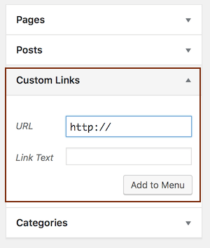
Enter the full URL of the target page in which the section occurs, followed by the pound sign and your ID. For example, if the section occurs on the page
https://www.example.com/goals/, then your URL would be:
https://www.example.com/goals/#my-unique-idEnter whatever link text you want your menu item to display.
Click Add to menu.