Color Picker
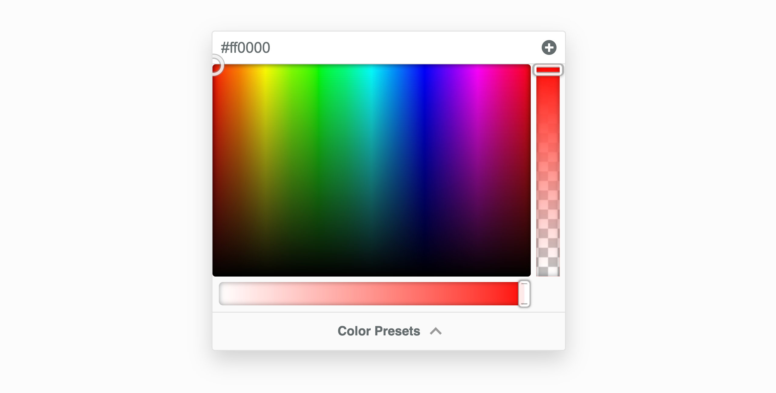
The Color Picker is used to select and adjust color values throughout the Beaver Builder user interface, such as backgrounds, buttons, text, and links. You can also adjust opacity, saturation, and save your favourite color presets.
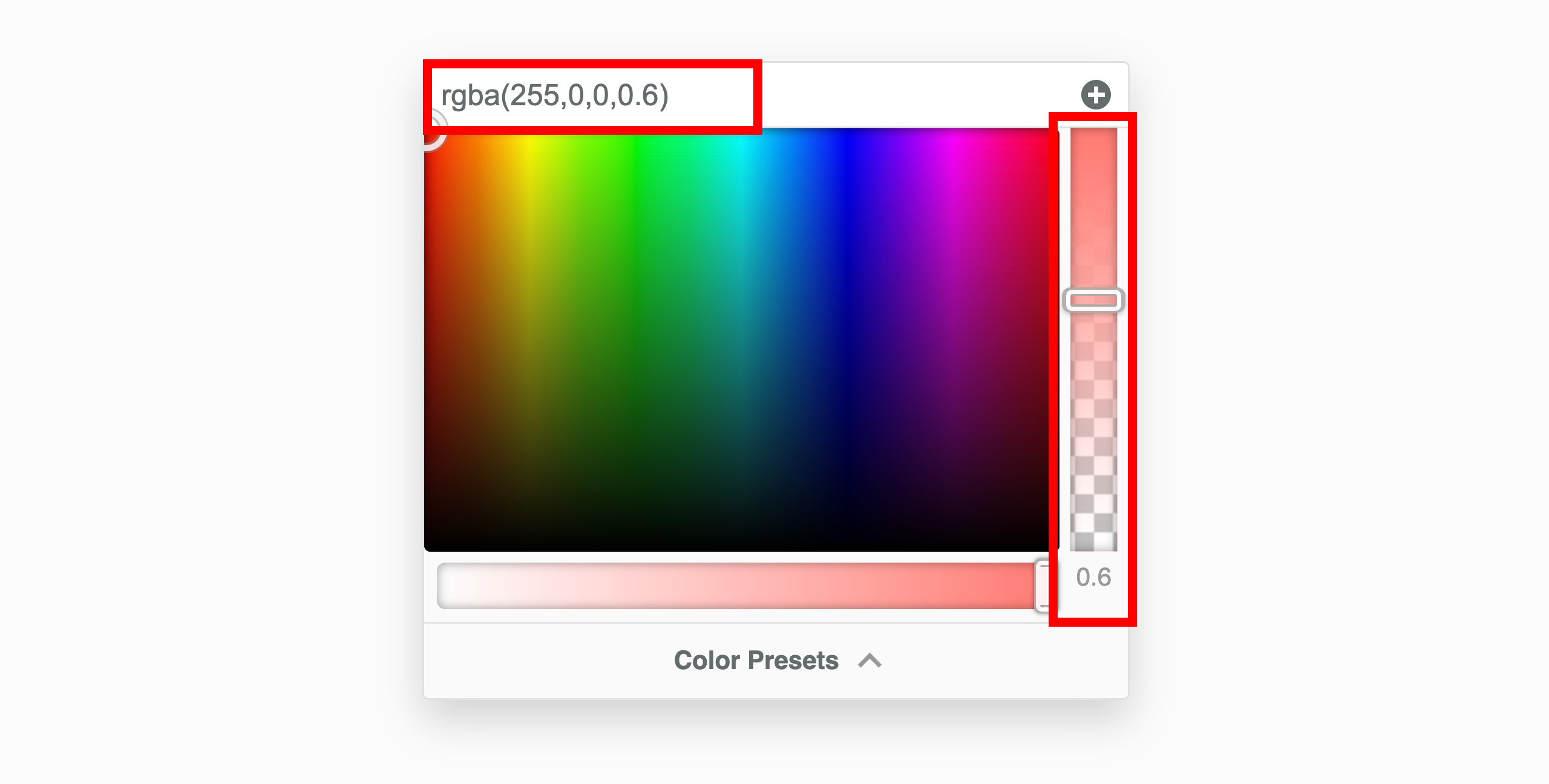
Opacity
The opacity slider located on the right-hand side uses the RGBa alpha channel (rgba(red, green, blue, alpha)) and when you adjust the opacity, you'll see the hex color value (#ffffff) change to the RGBa value (rgba(255,255,255,0.8)). Additionally, you can enter your own RGBa values in the input field at the top of the color picker.
Saturation
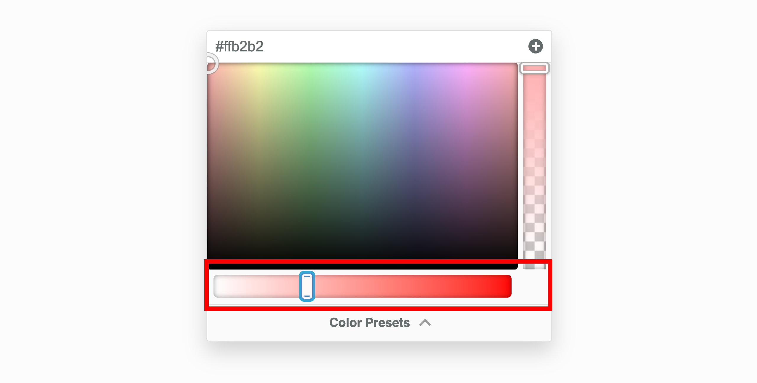
You can adjust the saturation of colors using the saturation slider located at the bottom. Color saturation is defined as the intensity of a color. For example:
- There are no shades of gray in 100%, it is pure color.
- 50% is 50% gray, but you can still see the color.
- 0% is completely gray and you cannot discern the color.
CSS Variables
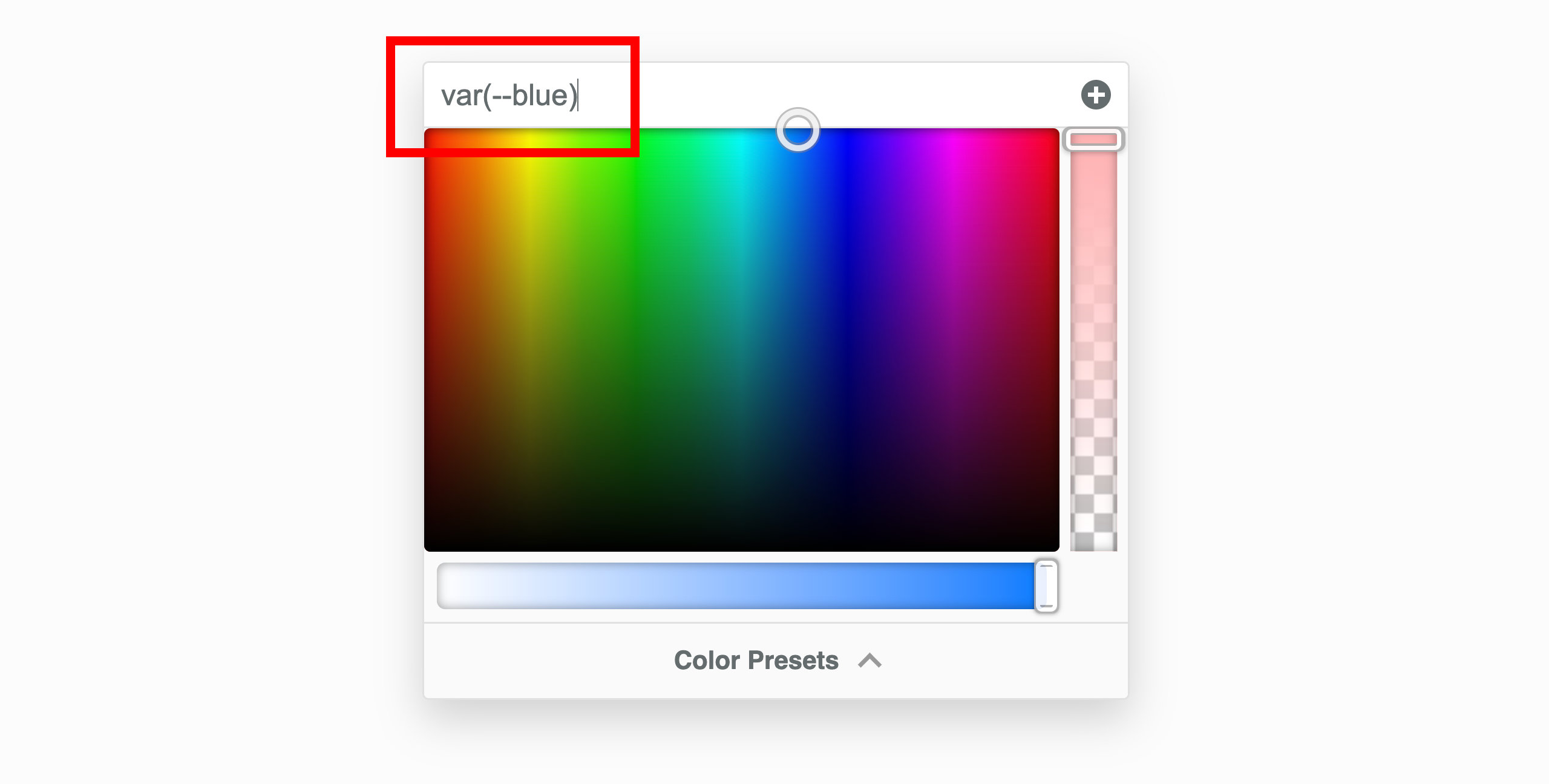
Instead of selecting a color from the color picker or entering a hex or rgba value, you have the option to use CSS variables. This is particularly useful when you intend to utilize a color that's already established in Global Styles, your theme, or a color defined in your custom CSS.
To integrate a CSS variable, input the name into the field at the upper part of the color picker. Remember to enclose the CSS variable name within var().
var(--css-var-name)
Color Presets
You can add single colors or color palettes to the Beaver Builder editor both manually and programmatically.
These two procedures will not replace existing colors in existing modules, but it makes it easier for you to select the new color in the future. Each of these procedures saves the colors so they are usable wherever you edit in Beaver Builder.
Add color manually
Launch Beaver Builder on your page or post.
Click on any Color setting for a row, columns, or module to open the Color Picker.
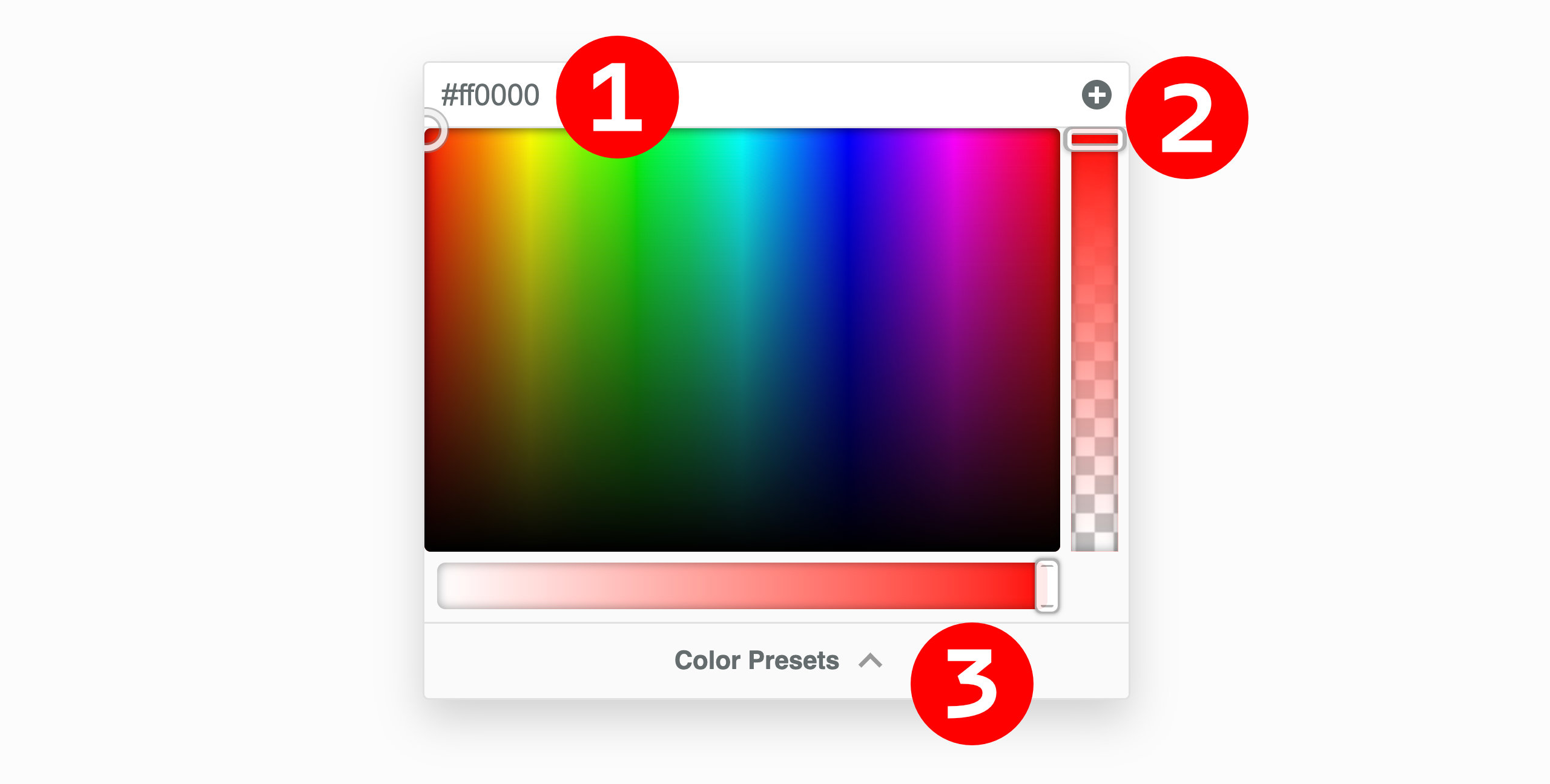
Select a color in the Color Picker or type/paste in a hex or RGBA color value for one of your colors. #1 in the screenshot below.
Click the Plus symbol (+) in the upper right corner of the Color Picker to create a preset. #2 in the screenshot below.
Review your color presets by clicking the Color Presets at the bottom of the Color Picker. #3 in the screenshot below.
Add color programmatically
You can register custom colors programmatically by using the fl_builder_color_presets filter.
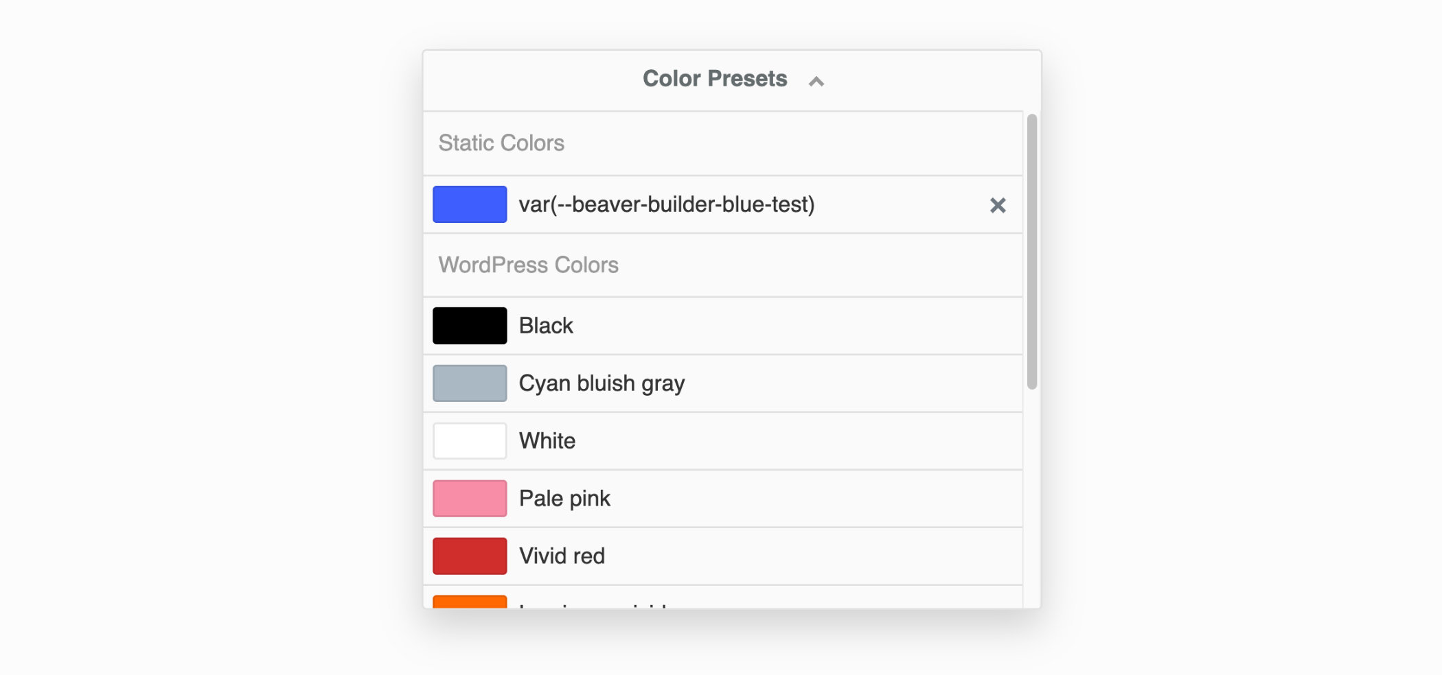
Check your current color presets by opening a module for editing in Beaver Builder, then choose a color field and click Color presets. Delete any presets that you don't want to keep by clicking the X icon next to the color.
Add the following code to your child theme's functions.php file.
You can edit this file in Appearance > Editor, but make sure you choose the correct file.
//Add color presets for Beaver Builder
function my_builder_color_presets($colors)
{
  $colors = [];

  $colors[] = "8E181B";
  $colors[] = "D11C23";
  $colors[] = "1A4688";
  $colors[] = "D6E1EE";
  $colors[] = "fdfffc";
  $colors[] = "f1d302";

  return $colors;
}

add_filter("fl_builder_color_presets", "my_builder_color_presets");
- Replace the hex values in the code with the hex value for each color you want to define. Add or remove
$colors[]lines accordingly.
Do not include the hash symbol (#) when specifying hex values.
You can also add color presets to the Customizer settings in the Beaver Builder child theme.
CSS Variable Preset
You can also include CSS Variables as color presets. To do this, input the name of your CSS Variable into the field at the top of the Color Picker and then click the Plus symbol (+) situated in the top-right corner of the Color Picker. The CSS variable will be incorporated as a color preset.
Please be aware that the name of the CSS variable will function as the color preset's name, and it cannot be altered.
Theme Colors
Theme Colors support are disabled by default and can be enabled by visiting the Beaver Builder settings page in the WordPress admin area and enabling the Load Theme Colors option in the Advanced tab.
When enabled, the color picker presets will automatically include the colors defined in Block themes or themes that register colors using the Block theme JSON API, such as BB Theme.
WordPress Core Colors
WordPress Core Colors are disabled by default and can be enabled by visiting the Beaver Builder settings page in the WordPress admin area and enabling the Load WordPress Colors option in the Advanced tab.
When enabled, the color picker presets will automatically include the WordPress Core colors.