Edit a column
You can edit a column's style (width, color, background, border) and its advanced settings.
Open column settings for editing
To open column settings in an empty column:
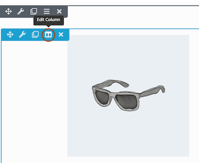
When a column is empty, access Column Settings by hovering over the empty column and clicking the Edit column icon, as shown in the following screenshot.
See this article for how to insert a column.
To open column settings for editing in a column with a module:
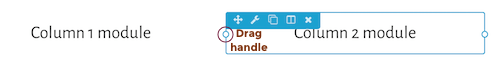
- Mouse over a module in the column to reveal the toolbar and click Edit column, as shown in the following screenshot.
If you see a hamburger icon in the module toolbar, click that and mouse over Edit column.
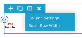
- Mouse over and then click Column settings.
The area that will be affected by the column settings will have a blue overlay when you mouse over it.
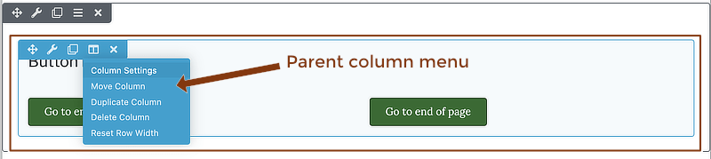 If you mouse over a child column and you want to edit its parent column, click Parent settings.
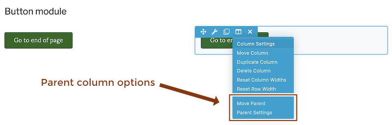
See this tip for identifying parent and child columns.
Style tab
Column dimensions
Width
By default, the columns in a column group total 100% width, divided equally.
When you have more than two columns across, it's easier to use the drag handle on the column instead of column settings to change the widths.
See this information for two methods to change column width when the column group has two or more columns.
See this information about adjusting the width of a single column.
Two or more columns must maintain a combined width of 100% on large devices but can have less than 100% total width on medium and small devices. See the article about setting custom widths for medium and small devices. Setting custom widths for smaller devices also prevents column stacking.
Minimum height
You can set a minimum height for any column in the layer.
Equalize heights
Selecting Yes makes all column heights in the column layer the same height as the column with the longest content. Equalizing heights also lets you vertically align the content to the top, center, or bottom. if you change the equalization settings for one column, it applies to all of the columns in the same horizontal layer.
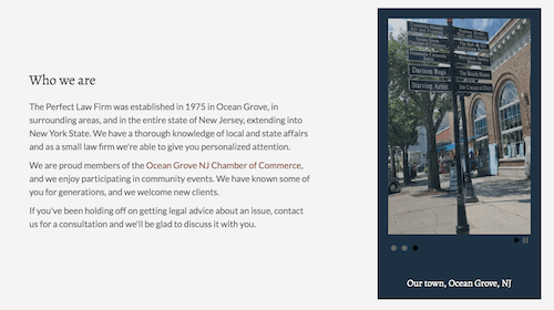
The following screenshot shows two columns set to equal height and centered.
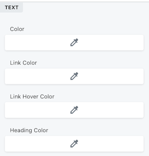
Text colors
You can set default text colors for the column. These colors override row colors for that column and apply to modules unless the modules have their own colors set. The options are text color, link color, text hover color, and heading color.
Background effects
You can add a background color, color gradient, or image to the column.
If you add an image, you can also add a color overlay.
If you choose a Photo background and set Position to Custom position, you can set X and Y coordinates to place the image more accurately in the background.
See this tip for determining column scope to see where the background effect will apply.
You can't add dynamic backgrounds to columns, such as videos, slideshows, or parallax.
Border
Columns have the standard Border section that lets you add border lines, rounded corners, and shadows.
Set individual top, bottom, left, or right border to create horizontal or vertical column separators. Adjust column margins and padding on the Advanced tab to fine-tune the border placement.
Advanced tab
There are all the usual Advanced tab settings for margins and padding, visibility, animations, and advanced HTML settings.