Row shape overlays
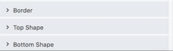
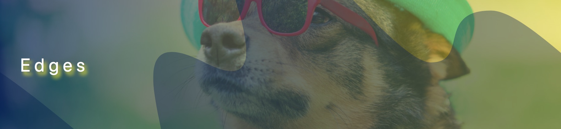
You can add and customize shape layers on rows. By default, rows can be assigned up to two shape layers, which by default are anchored to the top and bottom boundary of rows, so you can start with a top shape or bottom shape, as shown in this screenshot.
Shape settings appear below the Border section on the row's Style tab.
After you pick a shape (described in the next section), you can make the following customizations:
- Width
- Height
- Y offset (vertical position)
- Alignment within the row (top left, center, etc.)
- Color or gradient fill
- Orientation (flipped horizontally or vertically)
- Skew X (horizontally)
- Skew Y (vertically)
- Scale horizontally
- Rotate on a 360-degree axis
- Clip the shape container to the row boundary Enable this setting if the shape spreads out beyond the row boundary and you want to contain it.
The effect of these settings is that you can move the top and bottom shapes almost anywhere in the row and skew and modify the shapes.
These transforms are common concepts in graphics applications and UI/UX programming languages. In Beaver Builder, they are translated to CSS properties when the page is rendered. See this W3Schools article about CSS 2D transforms and browser support for them.
How to access row edge shapes
- Open a row for editing in Beaver Builder.
- On the Style tab, scroll down to the shape sections, following the Border section.
The following sections show examples of each type of shape.
Note: Be sure to test on various devices and in various browsers to make sure your shape settings work for all.
Shape choices
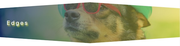
Slanted edge
Tip: To make the shape look clipped, select the same color for the edge as the content background color on your page. If you select a different color from the content background, you'll see a rectangular row or column with the shape overlaid on it. For example, in the Slanted Edge example in the next section, the first screenshot shows an example in which the shape color matches the content background (white), while the second screenshot shows an example in which the entire shape is visible because the shape color is different from the background.
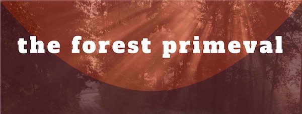
In the following screenshot, the slanted edge is applied to both the top and bottom edges. The background photo also has a background color overlay with a gradient.
Tip: Some users have reported seeing a thin horizontal line at the row border when they use a slanted edge. Adjusting the Y offset setting by 1 pixel should solve the issue.
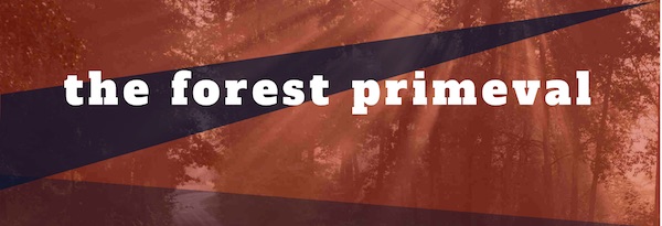
Here's an example of a slanted top edge used with a rotation and skew, combined with a slanted bottom edge with default settings.
Waves
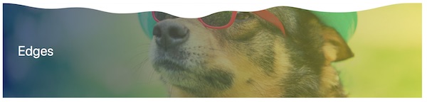
Here's an example of a white top wave.
Here's another example of a top wave in a navy color with reduced opacity, skewed and rotated both horizontally and vertically, scaled larger with a negative Y offset, which normally would move the effect upwards, but because of the rotation the negative Y offset moves the effect downwards. If the shape bleeds out of the row boundary, you can choose Clip contents in the Shape container section.
Midpoint
Midpoint has its highest point mid-row and is lower at each row end. This screenshot shows a white midpoint shape applied to both the top and bottom edge with minimal modification from the default settings.
Triangle
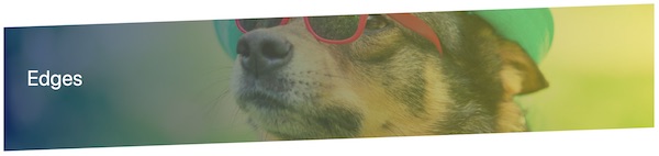
The triangle looks like a rotated midpoint, with its low point in the middle of the row. In the following screenshot, the triangle is set to a width of 600px to the cutout effect seems to point to the heading in the center.

Circle
In the following screenshot, the circle is a top shape that is set to Center alignment, so it appears in the vertical and horizontal center of the row. The color is set to 50% opacity.

Concave
The concave shape is flat on one edge and has a concave arc at the other end. In the following screenshot, there's a Concave shape at the row bottom with a height of 440px so it stretches up along the sides of the row.
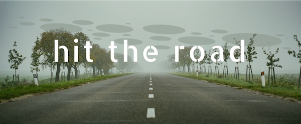
Spots
The Circles shape is a set of larger and smaller elliptical objects. In the following screenshot, the circles in a semi-opaque color were scaled a bit larger, aligned in the center of the row, and then the Y offset value was manipulated to move them slightly higher.
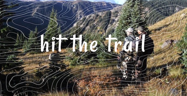
Topography
The topography shape produces concentric circles of the type that appear on topographic maps. Here's an example of a topographic shape with stretched height to cover the entire height of the background image.
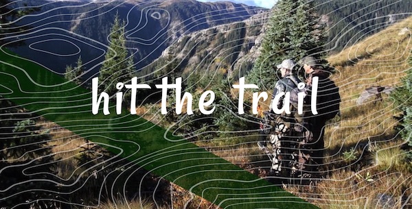
Rectangle
The rectangle shape is a rectangle placed where you want it. In the following screenshot, a rectangle shape at the top of the row was rotated to produce an angled band of color.

Or, here's an example in which a rotated rectangle shape was used at the top and topography used at the bottom.
Some technical details
The shape layers are rendered with a <div> element that covers the entire
row, and the SVG shape is positioned somewhere within that.
The fact that the shapes are aligned by default to the top and bottom of the row is just a convenience. In practice, you can flip and align the bottom shape layer and put it anywhere you can put the top shape layer. In fact, when you choose a bottom shape you'll notice the shape is automatically flipped top to bottom. This means with a bottom row, a positive Y offset will move the row up rather than down.
Fix for Internet Explorer 11
Row shapes use SVG art, which won't work on IE11. If you want to use row shapes and block them only on IE11, use the following CSS code. See this article about where to add custom CSS code.
body.fl-builder-ie-11 div.fl-builder-shape-layer {
  display: none;
}