Header layout type
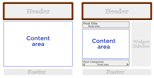
The Themer Header layout in Beaver Themer overrides the theme's top bar, header, and nav area, as shown in the following diagram, with a typical page on the left and a typical post on the right.
For more information about working with WordPress headers, see this blog post.
Choose a Themer Header layout template
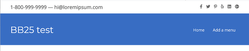
After you create a new Header-type Themer layout and launch Beaver Builder, the initial layout contains the Header 1 layout template, shown in the following screenshot.
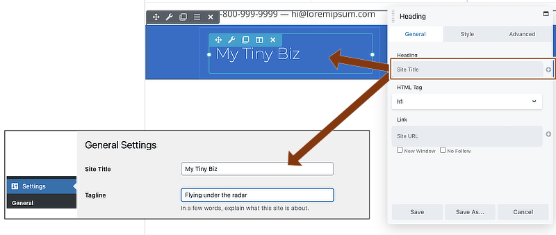
One advantage of starting with a Themer layout template is that some of the common field connections are built in. For example, shown in the next screenshot, the Heading module's Heading setting, where you'd normally enter the text for the heading, contains the Site title field connection. On the front end, this field connection is replaced with the setting in the Site title field on the General tab in your WordPress settings. This means that if you ever change your site title, you only need to change it in one place.
You can replace any field connection with static text if you prefer.
There are several Themer Header layout templates to choose from. Open the Content panel and click the Templates tab:
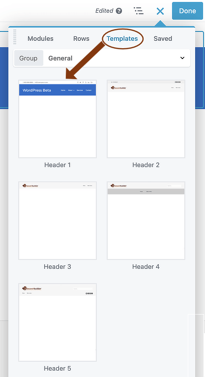
You can start with any template and modify or delete whatever you like.
Header 1 template
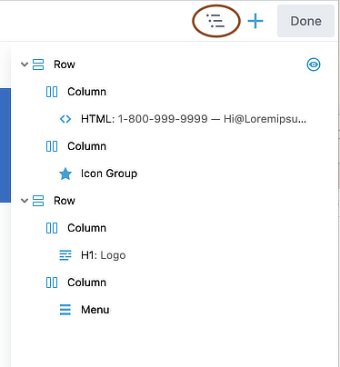
The structure of the Header 1 template is shown in the following screenshot of the Outline panel:
Layout
- Two rows, one for the top bar and one for the header area.
- Two columns in each row, with one module in each column.
The eye icon next to the row in the Outline panel indicates there's a special setting in the Visibility section of the Advanced tab. In this case, Breakpoint is set to Large & medium devices only, meaning this row is not visible on small devices.
Modules
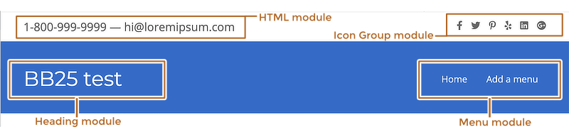
The first row has the following modules.
- An HTML module containing placeholder text for the phone number and email address.
See the Header 2 layout template for a different way to present the phone number. - An Icon Group module containing social icons.
The second row has the following modules:
- A Heading module
The Heading field contains a Site Title field connection.
Also, there are custom font settings in the Typography section on the Style tab. If you want to use the default heading style settings from your theme, delete these custom settings. - A Menu module
There are some custom margins set on the Advanced tab and custom padding set in various sections on the Style tab.
On the Style tab, there are custom colors set in the following sections:- Links
- Dropdowns
Header 2 template
The structure of the Header 2 template is shown in the following screenshot of the Outline panel:
Layout
- Two rows, one for the top bar and one for the header area.
- Two columns in each row, with one module in each column.
Modules
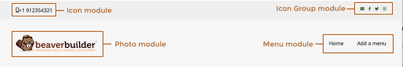
The first row has a custom background color and contains the following modules.
- An Icon module containing a mobile icon and a phone number.
Tip: The link in the placeholder phone number is#. A clickable telephone link would take the following form:<a href="tel:123-456-7890">123-456-7890</a> - An Icon group module containing social icons.
The second row has a custom background color and the following features:
- A Photo module pointing to the site logo image in the Media Library.
Tip: The Link type is set toURLin this template and the link is set to#. Normally the corporate logo in the header links to the home page, so you'd create a field connection to the Site URL. Find more information about the Site URL field connection in this Themer Header tutorial. - A Menu module
There are some custom margins set on the Advanced tab and custom padding set in various sections on the Style tab.
On the Style tab, there are custom colors set in the following sections:- Menu – the Menu background color (Mobile) setting
- Links
- Dropdowns
- Responsive dropdowns
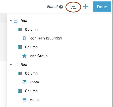
Header 3 template

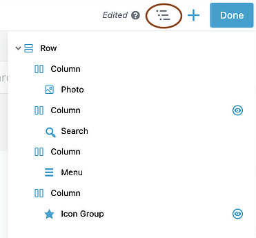
The structure of the Header 3 template is shown in the following screenshot of the Outline panel:
Layout
- One row with two columns and one module in each column.
Modules
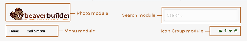
The row has a custom background color and contains a Photo module and a Menu module with the same settings as the Header 2 template.
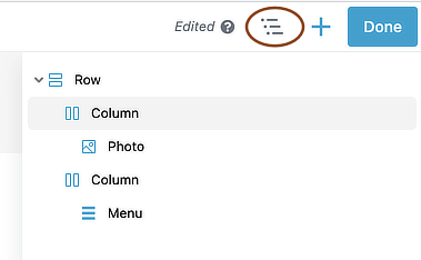
Header 4 template
The structure of the Header 4 template is shown in the following screenshot of the Outline panel:
The eye icon next to the column in the Outline panel indicates there's a special setting in the Visibility section of the Advanced tab. In this case, the column's Breakpoint is set to Large & medium devices only.
Layout
- Two rows, one for the header area and one for a nav bar.
- Two columns in the first row and one in the second, with one module in each column.
Modules
The first row has a custom background color and contains the following modules.
- A Photo module pointing to the site logo image in the Media Library.
Tip: The Link type is set toURLin this template and the link is set to#. Normally the corporate logo in the header links to the home page, so you'd create a field connection to the Site URL. Find more information about the Site URL field connection in this Themer Header tutorial. - A Search module
The Style tab has a custom width set and there are also custom margins and padding set in various locations on the Style and Advanced tabs.
The second row has a Menu module with the following custom settings:
- There are custom margins set on the Advanced tab and custom padding set in various sections on the Style tab.
- On the Style tab, there are custom colors set in the following sections:
- Links
- Dropdowns
- Responsive dropdowns
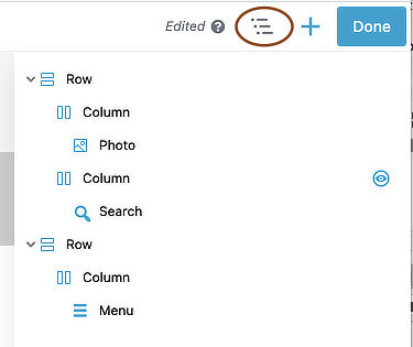
Header 5 template
The structure of the Header 5 template is shown in the following screenshot of the Outline panel:
The eye icon next to the second column and the Icon Group module in the Outline panel indicates there's a special setting in the Visibility section of the Advanced tab. In both cases, the column's Breakpoint is set to Large & medium devices only.
Layout
- One row with two column layers, described below.
Modules
The first column layer has two columns:
- Column 1: Photo module pointing to the site logo image in the Media Library.
Tip: The Link type is set toURLin this template and the link is set to#. Normally the corporate logo in the header links to the home page, so you'd create a field connection to the Site URL. Find more information about the Site URL field connection in this Themer Header tutorial. - Column 2: Search module
The second column layer has two columns:
- Column 1: Menu module
There are custom margins set on the Advanced tab and custom padding set in various sections on the Style tab.
On the Style tab, there are custom colors set in the following sections:- Links
- Dropdowns
- Responsive dropdowns
- Column 2: Icon Group module
Edit Themer Layout settings
The Edit Themer layout screen has the following settings for Header layouts:
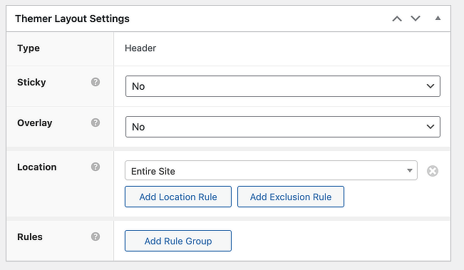
- Header properties (sticky, shrink, overlay, described below).
- The locations on your site where the header applies.
- Optional conditional logic rules.
If you set the WordPress edit page's Page Template to a template that has no header for a particular post or page, it will not remove the header produced by a Themer layout. You must control where the Themer header occurs through the Location settings here.
Sticky, Shrink, and Overlay settings
There are several settings that control how the header behaves.
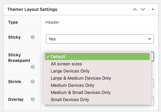
- Sticky
This is equivalent to the fixed header in the Beaver Builder Theme. The header stays in place at the original size while the page is scrolled.
If you set Sticky to Yes, you then choose device size breakpoints in the Sticky breakpoint setting. The Default setting supports large devices only (the legacy setting). It also supports thefl_theme_builder_sticky_header_breakpointfilter, which enables the sticky header for medium but not small devices. - Shrink (applies to large devices only)
If you choose a sticky header, you also get the option to shrink it as the page scrolls up. The amount of shrink is determined by the height required for the full-size header logo, text, and menu.
If the Shrink setting is set to Yes it also follows the Sticky header setting for device size. - Overlay (applies at all screen sizes)
The row background for the header becomes transparent, and the content row moves up to the top of the window.
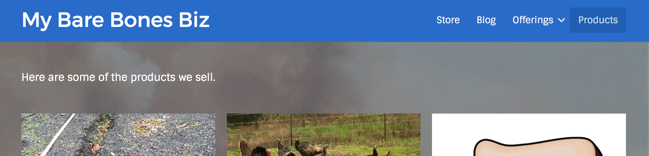
Here's an example of a header overlay:
In this screenshot, the background image is set on the first row in the content area (along with a dark gray background overlay color set to 50% opacity). That row's bottom padding is set to 160px to push down the page title so it doesn't interfere with the header.
The Overlay setting is independent of the "Sticky header" setting and works at all device sizes.
You can enable all three sticky, shrink, and overlay settings, and here's how they work in combination.
- If you enable Overlay plus Sticky, on large devices the transparent header converts to a sticky header as soon as you start to scroll. The sticky header background is whatever you set for the header row background.
- If you enable Overlay plus Sticky plus Shrink, the header shrinks as you continue to scroll down, just the way it does when there's no overlay.