Box Module
The Box Module allows users to add Flexbox and CSS Grid layouts to Beaver Builder Page Builder Layouts.

Requirements
The Box module requires WordPress 5.2 or later; otherwise, it won't appear in the Beaver Builder user interface (UI) due to its dependence on JavaScript code from WordPress Blocks.
Usage
The Box module operates similarly to a row or column, acting as a versatile container. It utilizes either flexbox or CSS grid, enabling the creation of intricate, fluid, and adaptable layouts. Boxes can be nested, stacked, and organized in both horizontal and vertical orientations, as well as within a grid system.
Flexbox and CSS Grid are distinct CSS layout models, each offering its own strengths and purposes:
- Flexbox excels in one-dimensional layouts, perfect for arranging items in rows or columns with flexibility in sizing and alignment.
- CSS Grid, on the other hand, is tailored for two-dimensional layouts, providing precise control over rows and columns, facilitating more elaborate designs.
These layout models often complement each other. For example, flexbox can be utilized within individual grid items to manage their internal structure, capitalizing on the combined benefits of both models for comprehensive layout solutions.
Usage Examples
The Box module can be used to create a wide variety of layouts. Here are just a few examples:
- Effortlessly center content both vertically and horizontally.
- Nest boxes within boxes to create intricate layouts.
- Create a responsive grid of boxes that wraps automatically without utilizing the Responsive Toggle.
- Design complex grid-based layouts for overall page structure.
- Create a card layout by using the Link option in the Box module.
- Reduce the amount of HTML markup in the DOM which can improve page load times and SEO.
- Stack modules on top of each other without the need for custom CSS.
Add a Box Module
To add a Box module to your layout:
- Launch Beaver Builder on the page where you want to add the Box module.
- Click the + icon to open the Content Panel.
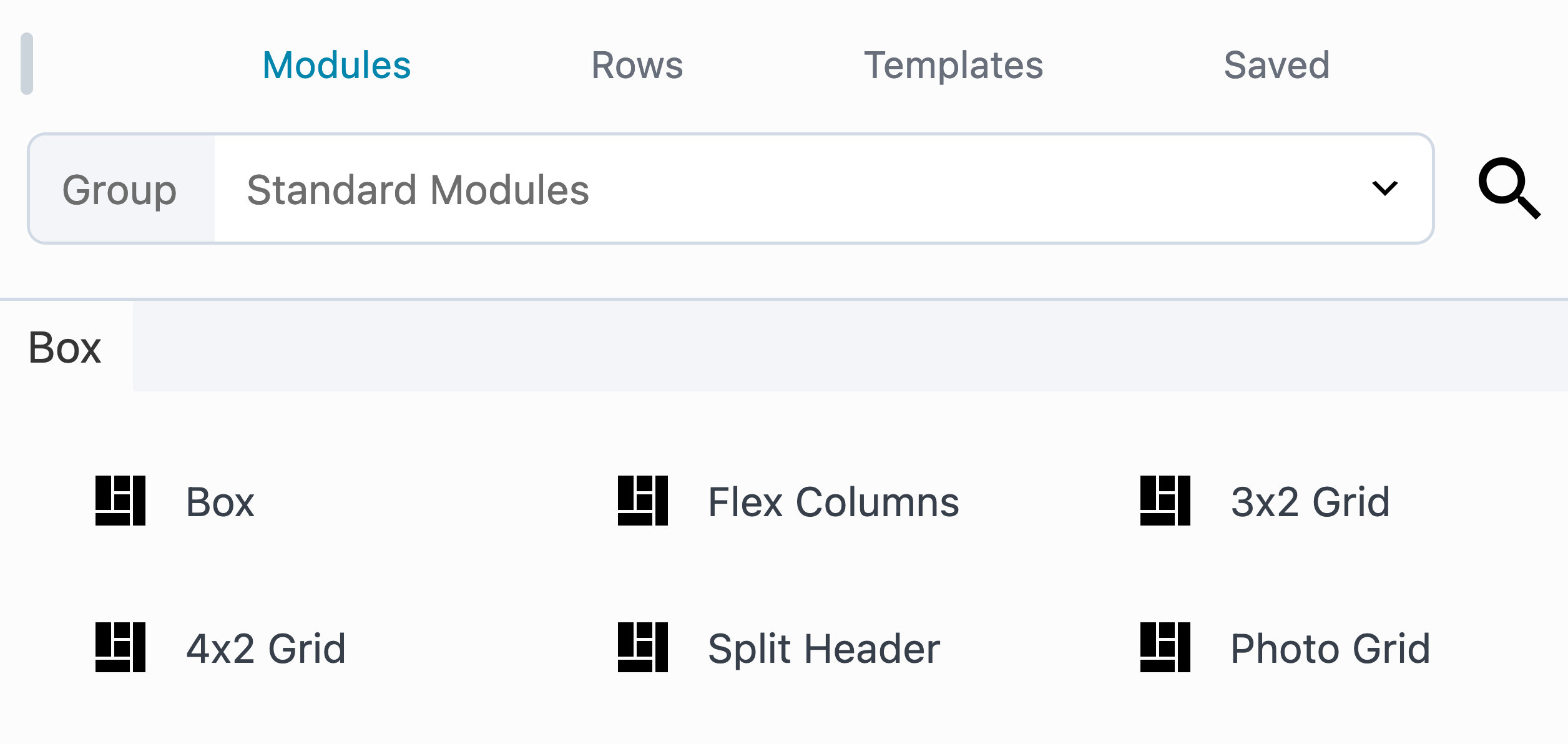
- Access the modules library by clicking the Modules tab.
- Scroll down to the Box module and drag it to the desired location on the page.
Note that the Box module should be placed inside a row. If you try to drag the Box module onto the page without first placing it inside a row, a row will be automatically created for you.
Nest Boxes
To nest boxes within boxes, simply drag a Box module into another Box module. This makes it easy to create intricate layouts. Moreover, you can seamlessly combine both flexbox and CSS grid to design sophisticated layouts.
Module Aliases
The Box modules comes with several Modules Aliases that can be used to create common layouts. They are included for convenience and to help users get started with the Box module.
Flex Columns: Utilizes flexbox to arrange three boxes horizontally within the parent container.
3×2 Grid: Establishes a layout with three rows and two columns using grid boxes inside the parent container.
4×2 Grid: Defines a grid structure with four rows and two columns of grid boxes within the parent container.
Split Header: Features a grid layout with three columns, creating a distinct header structure.
Photo Grid: Constructs a layout consisting of a 4×3 grid incorporating photo modules within the parent container.

In this Section
🗃️ Settings
2 items