Number Counter
The Number Counter module displays a number in an animated fashion, with the counter going from zero to the number or percent you specify.
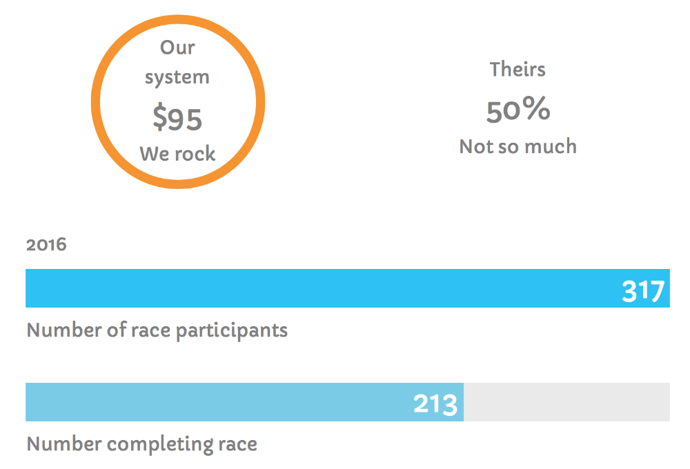
You can configure the Number Counter module in many different ways, as you can see in this screenshot with four Number Counter modules.
- You can choose a circle, a horizontal bar, or just the number.
- You can choose the number to be displayed as a percent or standard (an absolute value).
- If you choose standard numbers, you can add a prefix (such as the dollar sign) or a suffix (such as a euro sign) to the number.
- You can add text over or under the number, or neither.
- You can specify colors and typography for the counter and text, and
- You can change the animation speed and delay for the counter, circle, and bar to progress from zero to its number value.
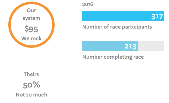
If you want to compare two or more numbers, add a Number Counter module to display each number, as shown in the screenshot example. Here are the same four Number Counter modules moved into a different layout:
Number Counter module settings
General tab
- Layout See the screenshots above for examples of the choices of circles, bars, or only numbers. If you choose Bars counter, there's an additional setting for Number position: the number can appear inside, above, or below the bar, or be hidden entirely.
- Number type Choose Percent or Standard. The Standard setting means the actual number provided in the next setting.
- Number The number that represents progress so far.
- Total The number that represents the total amount, the goal, and so on. If you choose Percent as the number type, the number is displayed as a percent with a percent symbol following. It's calculated as the value in the Number field divided by the number in the Total field. If you choose Standard as the number type, the value in the Number field is displayed as the number. The progress counter in the circle or bar is shown as the percent of the value in the Number field divided by the number in the Total field.
- Text before number This setting is to optionally add any text that you want to appear above the number.
- Text after number This setting is to optionally add any text that you want to appear below the number.
- Number prefix This option is only available when the number type is Standard. It lets you add a symbol or text immediately before the number with no intervening space, such as $.
- Number suffix This option is only available when the number type is Standard. It lets you add a symbol or text immediately after the number with no intervening space, such as €. For another example, if your number type is Standard and you entered a percent value such as 50 in the Number field and 100 in the Total field, you could add a % symbol here as a suffix.
- Animation speed The number of seconds to reach the Number value, shown in the circle, the bar, and the number itself. You can use decimals for partial seconds.
- Animation delay Number of seconds before the animation begins. You can use decimals for partial seconds.
Style tab
The Style tab has an unnamed top section with text color and typography settings, and a section with style options for the circle or bar, depending on what you selected for Layout.
Top section
- Text color If you have settings for Text before number or Text after number on the General tab, this setting controls the color of that text.
- Text typography This is the standard Beaver Builder Typography section, with settings for the font family, weight, size, spacing, and so on. It applies to the text before or after the number if you have added any.
- Number color The color of the number displayed, plus the color of the optional Number prefix or Number suffix for Standard number types.
- Number typography The standard Typography section.
Bar Styles section
This section appears only when Layout on the General tab is set to Bars counter.
- Bar foreground color Sets the color of the portion of the bar that indicates the Number value.
- Bar background color Sets the color of the portion of the bar that indicates the Total value.
- Bar height (responsive) Sets the height of the bar. This number can be varied by device size, using the responsive settings icon.
Circle Bar Styles section
This section appears only when Layout on the General tab is set to Circle counter.
- Circle size Sets the outer diameter of the circle.
- Circle stroke size Sets the width of the stroke.
- Circle foreground color Sets the color of the portion of the circle that indicates the Number value.
- Circle background color Sets the color of the portion of the circle not taken up by the foreground circle.
Advanced tab
There are all the usual Advanced tab settings for margins, visibility, animations, and advanced HTML settings.