Posts Carousel
In the Posts Carousel module, a set of posts or pages is displayed as a single row of posts in either Grid layout (with post title and info underneath the featured image) or Gallery view (with post title and info replacing the featured image on mouseover), as shown in the following screenshots of the two layouts.
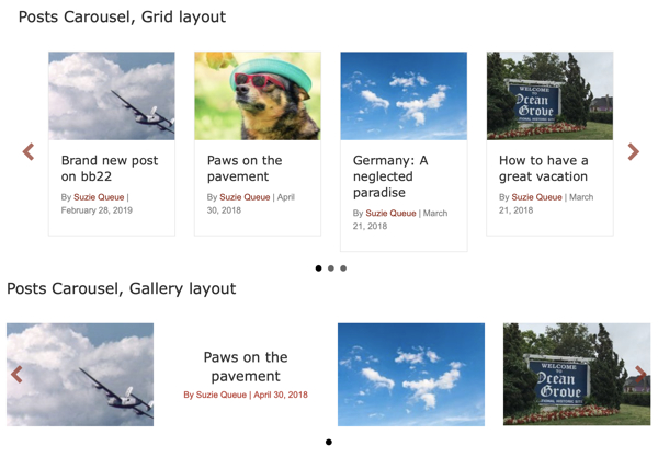
Autoplay, looping of the posts, and navigation icons (dots, arrows) are all optional.
Not sure which Posts module to use? See the comparison article.
Slider tab
| Section | Field | Description |
|---|---|---|
| Layout | Grid displays the post title and post info below the featured image. Gallery displays the featured image, with post title and info replacing the featured image on mouseover. In Grid layout, you can hide the featured image on the Layout tab, with the result that the post info displays where the image normally appears. Gallery layout does not have the option to hide the featured image, since the result would be the same as for Grid layout. | |
| Auto play | If Yes, the display moves through the posts automatically, unless the user intervenes by clicking on the dots or arrows or moving the cursor over one of the posts. If No, there is no animation and user must use the navigational aids. | |
| Delay | Number of seconds each post is displayed. This setting is used only if Auto play is enabled. | |
| Loop | If Yes, the list of posts is displayed in a repeating continuous carousel. If No, the list of posts ends when the last post is reached. This behavior occurs whether autoplay is enabled or not. | |
| Transition speed | When autoplay is enabled, the speed in seconds at which one slide moves to the next when the Delay time has finished. | |
| Number of posts | Maximum number of posts to display. Which posts are selected depends on the filters set on the Content tab. | |
| Number of slides to move at a time | Advances the display of posts or pages forward by the number in this field. By default the value is 1. | |
| Slider controls | Show dots | If Yes, a set of horizontal dots is displayed at the bottom of the carousel. The number of dots equals the Number of posts value, and one dot is highlighted to indicate which post in the sequence is being displayed. Visitors can manually change the display by clicking one of the dots. |
| Show arrows | If Yes, a left and right arrow is displayed on either side of the post list so user can move ahead or back manually. You can style the arrow color, background color, and background shape on the Style tab. |
Layout tab
| Section | Field | Description |
|---|---|---|
| Posts | Post max width | Determines the maximum width of each post in the list. Depending on display width of the browser, a larger max width means larger featured images and fewer items visible in the carousel row. As browser width decreases, the display decreases to a single item and eventually the idth of that single item decreases. |
| Post spacing | Number of pixels between posts in the list. | |
| Equalize column heights | (Grid layout only) If set to Yes, the border around every post is the same size. | |
| Post hover transition | (Gallery layout only) The type of animation when the post title and post info replace the featured image on mouseover. | |
| Featured image | Image | (Grid layout only) Show or hide the featured image. |
| Size | Which size image from the WordPress Media Library to use. Note: The image will always be sized to fit the post max width, so this setting affects image resolution rather than the actual size of the image on the page. This setting doesn't change the amount of crop. Increasing mage size increases the size of the file loaded, which can affect page load time. | |
| Crop | Crops the featured image to a particular shape. Note that this may cut out some parts of the image. | |
| Icons (Gallery layout only) | Use icon for posts | Choose Yes to display an icon on the line above or below the text when the post title and post info are displayed on mouseover. |
| Post icon | (Appears when Post icon is set to Yes for Gallery layout) Choose the icon to be displayed. | |
| Post icon position | (Appears when Post icon is set to Yes for Gallery layout) Choose whether the icon appears above or below the post title and post info. | |
| Post icon size | (Appears when Post icon is set to Yes for Gallery layout) Specify icon size in pixels. | |
| Post info | Author | Show or hide the post author. |
| Date | Show or hide the post date. | |
| Date format | (Appears when Date is set to Show ) Select Default to use the WordPress date format specified in Settings > General or override the default with a specific date format. | |
| Comments | Show or hide the number of comments. | |
| Content (Grid layout only) | Content | Show or hide post content. If set to Yes, the entire post excerpt is displayed, if the post has content in the Excerpt field. If there's no excerpt, the WordPress default of the first 55 words of the post content is displayed, with an ellipsis of three dots at the end to show there is more content. |
| More link | Show or hide the Read more link after the post content. If set to Show, you can also customize the default Read more text. | |
| More link text | Customize the default Read more text. |
Style tab
| Section | Field | Description |
|---|---|---|
| Carousel item | Background color | A background color that can be seen for items with no featured image. |
| Icon color | The color of the icon, when one has been set on the Layout tab. | |
| Post title | Color | Text color of the post title. |
| Typography | The standard Beaver Builder typography section for the post title. | |
| Post info | Color | Text color of the post info. |
| Typography | The standard Beaver Builder typography section for the post info. | |
| Nav arrows (Only when Show arrows is set to Yes on the Slider tab) | Arrows background color | Sets the color of a circle or square background behind the navigation arrows. When no color is set, there is no background circle or square. |
| Arrows background style | When Arrows background color is set, this option sets the arrow background to a circle or a square. | |
| Arrows color | Sets the color of the arrows themselves. |
Content tab
| Section | Field | Description |
|---|---|---|
| Source | Main query or custom query. The default for a standard Beaver Builder layout is Custom query, which enables all the other fields on this tab. In Beaver Themer, the default is Main query, because normally for a Themer layout you want the query for posts to be based on whatever archive page the query is created for. | |
| Custom query | Post type | Choose pages, posts, or a custom post type, such as WooCommerce Products or a custom post type that you create yourself. |
| Order | Descending or ascending, and whether it is by date, numerical, or alphabetical depends on the Order by setting. | |
| Order by | The choices are Author, Comment count, Date, Date last modified, ID, Menu order, Meta value (alphabetic or numeric), Random, Title. If you display pages in Menu order, you are effectively displaying a menu, with the added ability to display a content summary of the page. The Meta value option enables ordering by a custom field. If you select either the alphabetic or numeric Meta value option, a Meta key field appears so you can enter the key ( meta_key). | |
| Offset | Enter an integer if you want to skip a certain number of posts in the order specified in the Order setting. | |
| Exclude current post | Excludes the current post from the query. This is useful when you are using the module to create a list of related posts on a single post page. | |
| Filter | Posts, Pages, Products, etc. | (The label matches the single post name for the Post type you set) Include or exclude a set of posts, page, products, etc., by title. Start typing a word, and the titles containing that word will be displayed for you to choose. Keep selecting titles until you have the set you want to include or exclude. You can reorder matched selections and they are reflected in the front end. See an example for the Posts module at Selection Order in Filtering. |
| Categories | (Hidden when the Post type setting is Pages ) You can include or exclude categories to display. The third setting, Match related categories except, is useful in Singular-type Themer layouts when you want to use the Posts module to display a list of related posts, and you want to display the related posts in a family of categories except for the specific categories that you name. | |
| Tags | (Hidden when the Post type setting is Pages ) You can include or exclude tags to display. The choices are the same as for including or excluding categories. | |
| Authors | You can include or exclude posts or pages by specific authors. |
Advanced tab
There are all the usual Advanced tab settings for margins, visibility, animations, and advanced HTML settings.